A responsive website overhaul for a client’s custom baking business, designed to support her business and reach a wider customer base.
Project Type
Client Project
Timeline
8 Weeks
My Role
UX/UI Designer
UX Researcher
Skills
UX/UI Design, User Research & Interview, Ideation, Branding, IA, Wireframing, A/B Testing, Prototyping, User Testing
Tools
Figma
FigJam
Google Forms
Lyssna
OVERVIEW
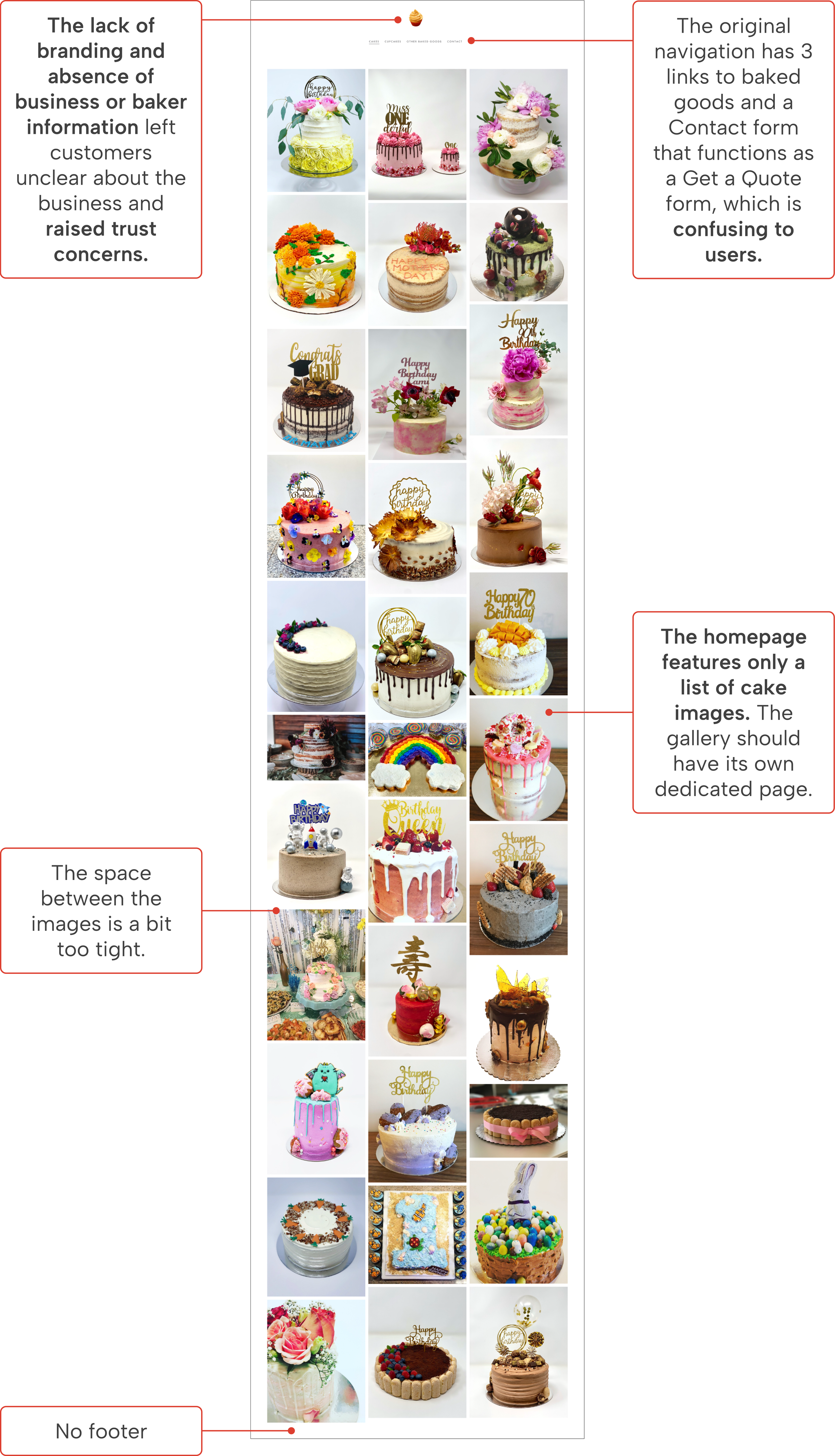
Dressed to Bake’s website is underperforming
Background
Nikki, a self-taught baker and owner of Dressed to Bake in NYC, specializes in custom cakes and cupcakes. She relies on word of mouth and social media to drive her business, as her website faces low traffic due to design, content, and usability issues.
The website is in need of a refresh
Problem
The Dressed to Bake website features only a gallery as the homepage and a contact form that functions as a quote request form. It lacks branding, key information, and usability, making it challenging for customers to navigate the website, understand her services, and trust her business.
I was contracted to redesign the Dressed to Bake website. This project involved substantial changes to the website’s design, navigation, functionality, branding, and content. The overhaul aimed to enhance performance, aesthetics, and usability while supporting business goals and user need.
An overhaul of the Dressed to Bake website
Solution
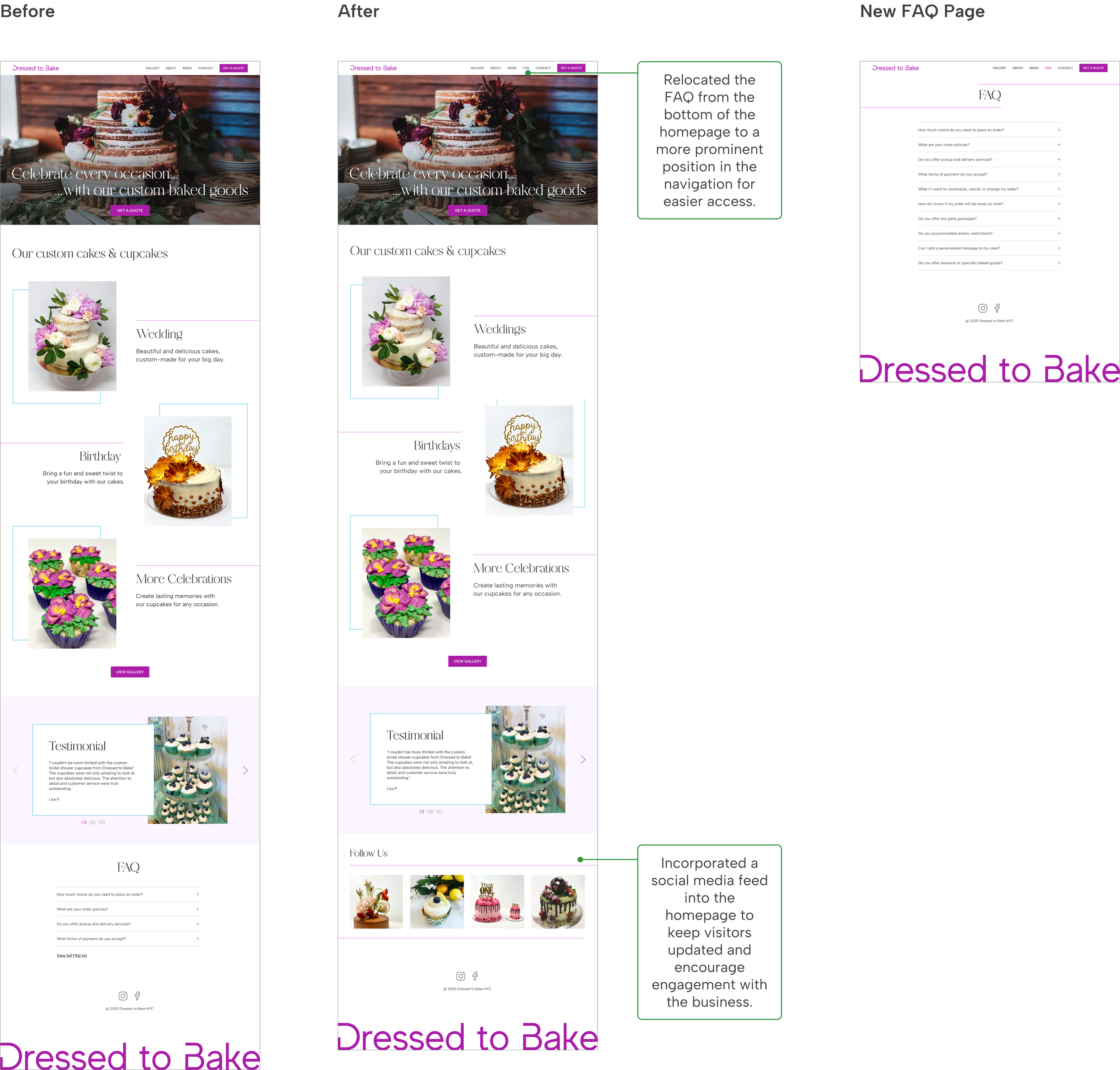
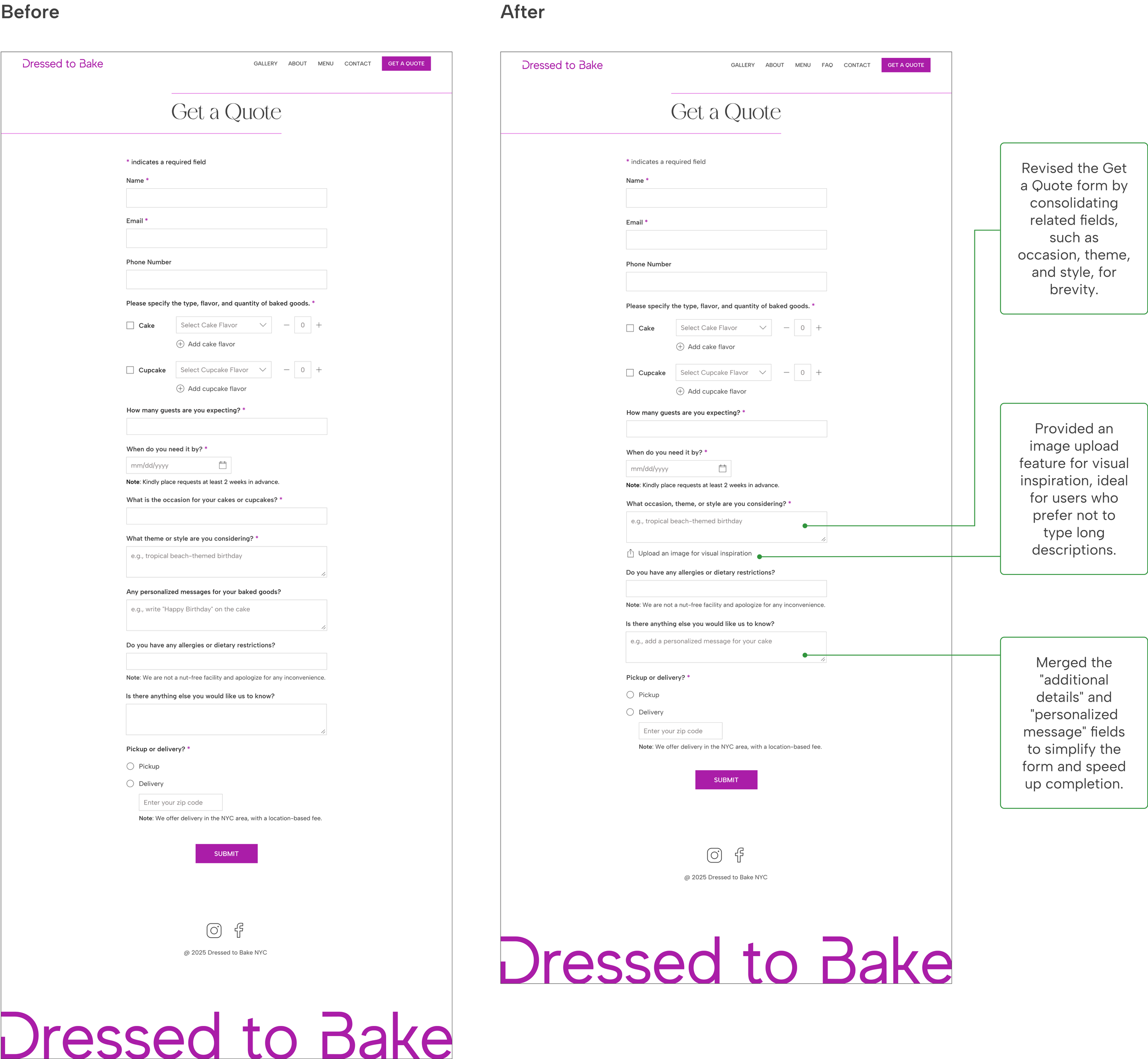
Homepage (Before)
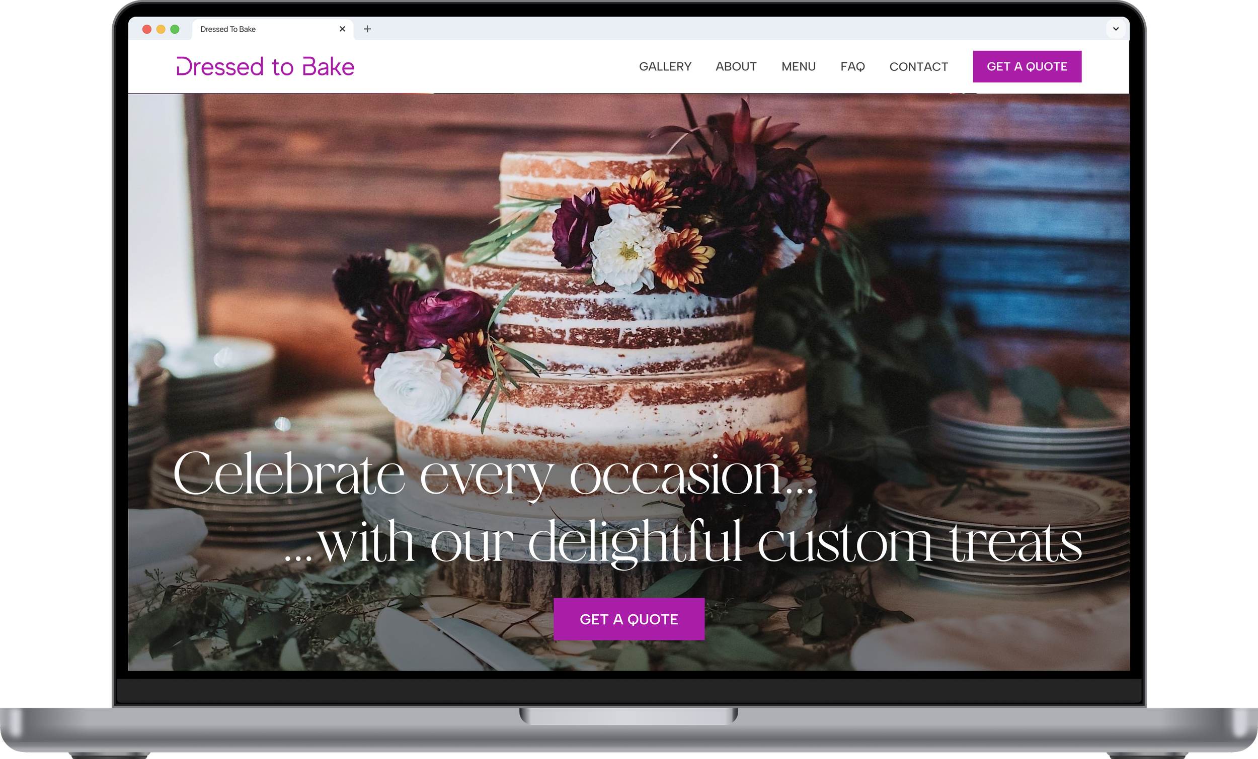
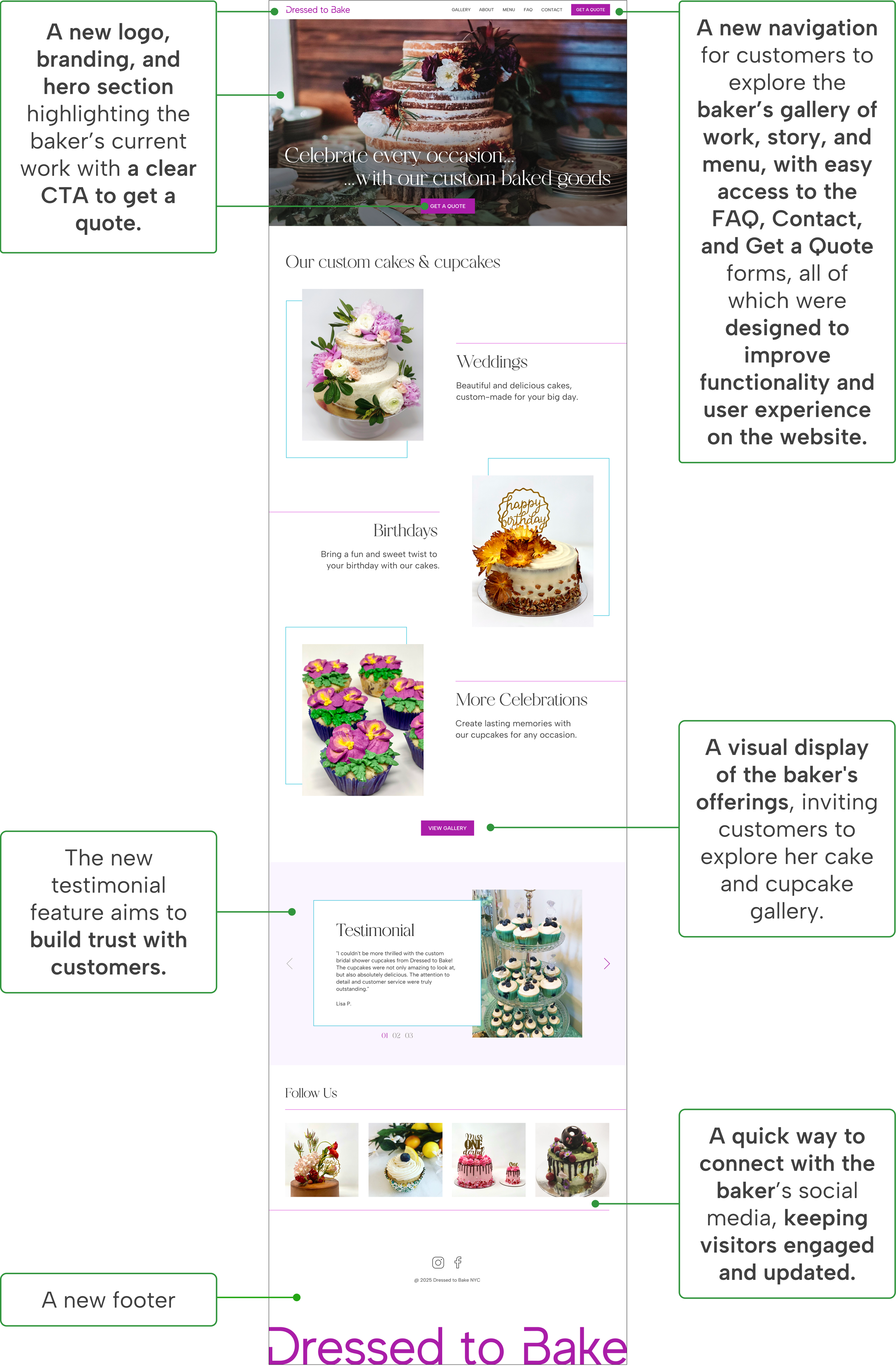
Homepage (After)
RESEARCH
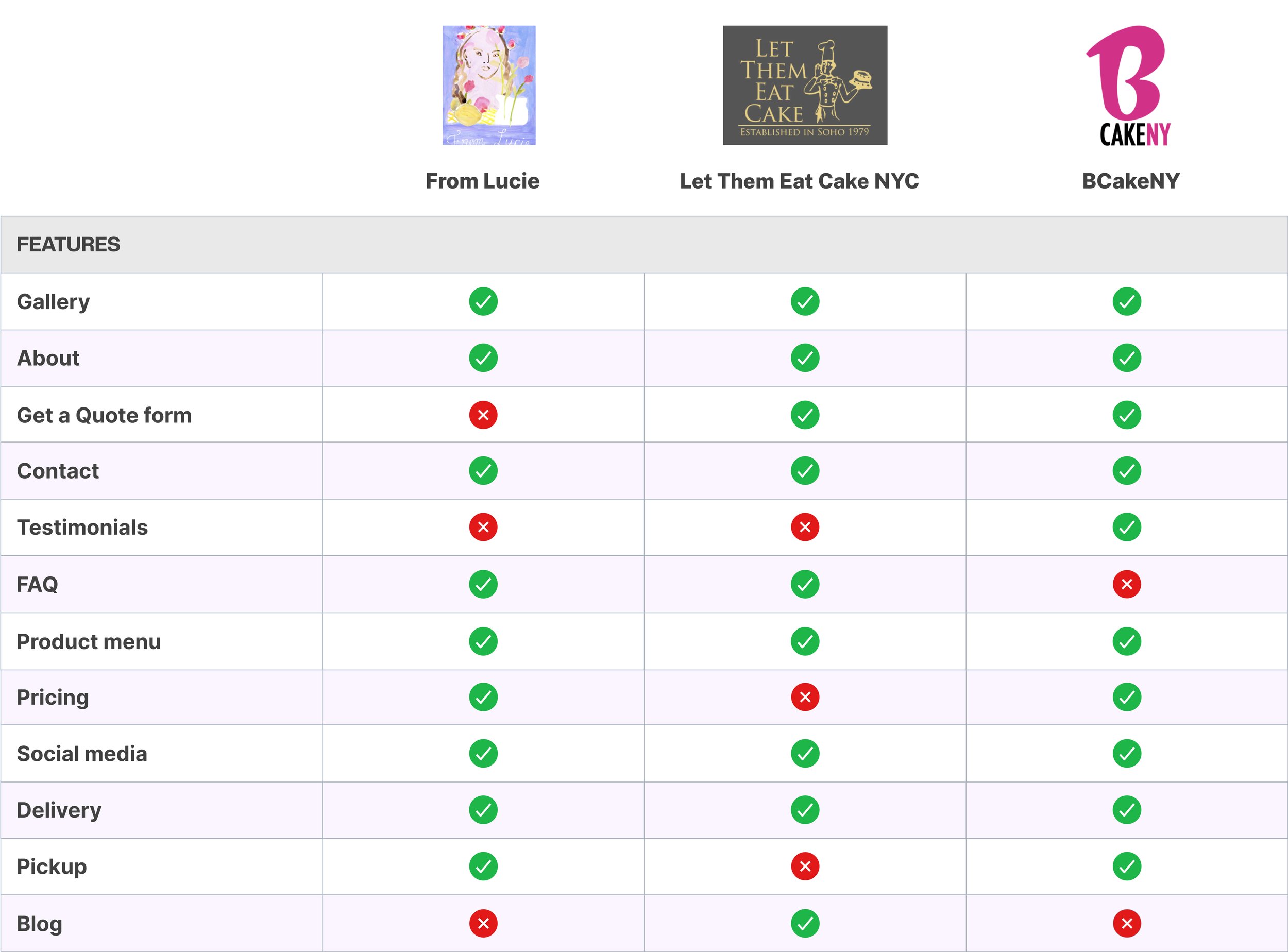
I analyzed 3 local custom baking businesses, focusing on assessing their products, content, and features. I presented the findings to the client to define the necessary features, including gallery, about, menu, FAQ, testimonials, contact, and get a quote form.
Determining core features for the website
Competitor Analysis
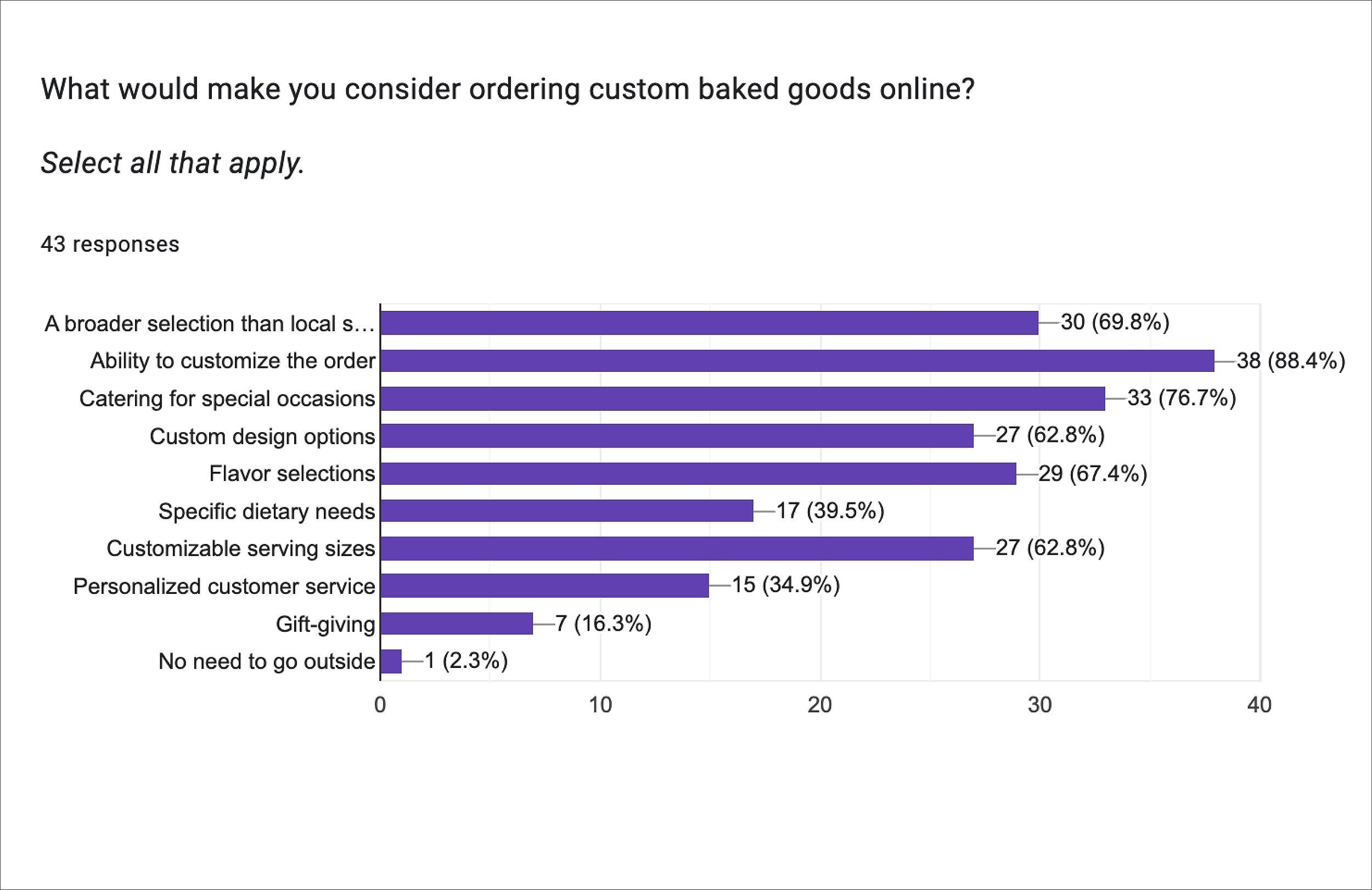
Surveys
What matters most to customers?
43 participants completed the survey.
88.4% of users chose custom baked goods because of the ability to customize their orders.
79.1% of users value reviews, 74.4% consider cost, and 72.1% need business and baker’s info when choosing a custom baking service.

User Interviews
Key takeaways from 5 moderated user interviews, focusing on the existing website
Users lack trust in this business due to the absence of info about the business and the baker.
The gallery is helpful for showcasing the baker’s work, but it's unclear what flavors are offered.
The Get a Quote form is crucial for users to get pricing quotes and for the client to generate business, but it lacks key details, such as flavor options, clear instructions (no FAQ on the website), and available delivery areas.
Meeting the client to understand her goals
Business Goals
I started the project by meeting with the client to understand her custom baking business and her business goals, which include:
1. Strengthening branding and increase her online presence
2. Streamlining the custom ordering process
3. Building trust to drive business growth
DEFINE
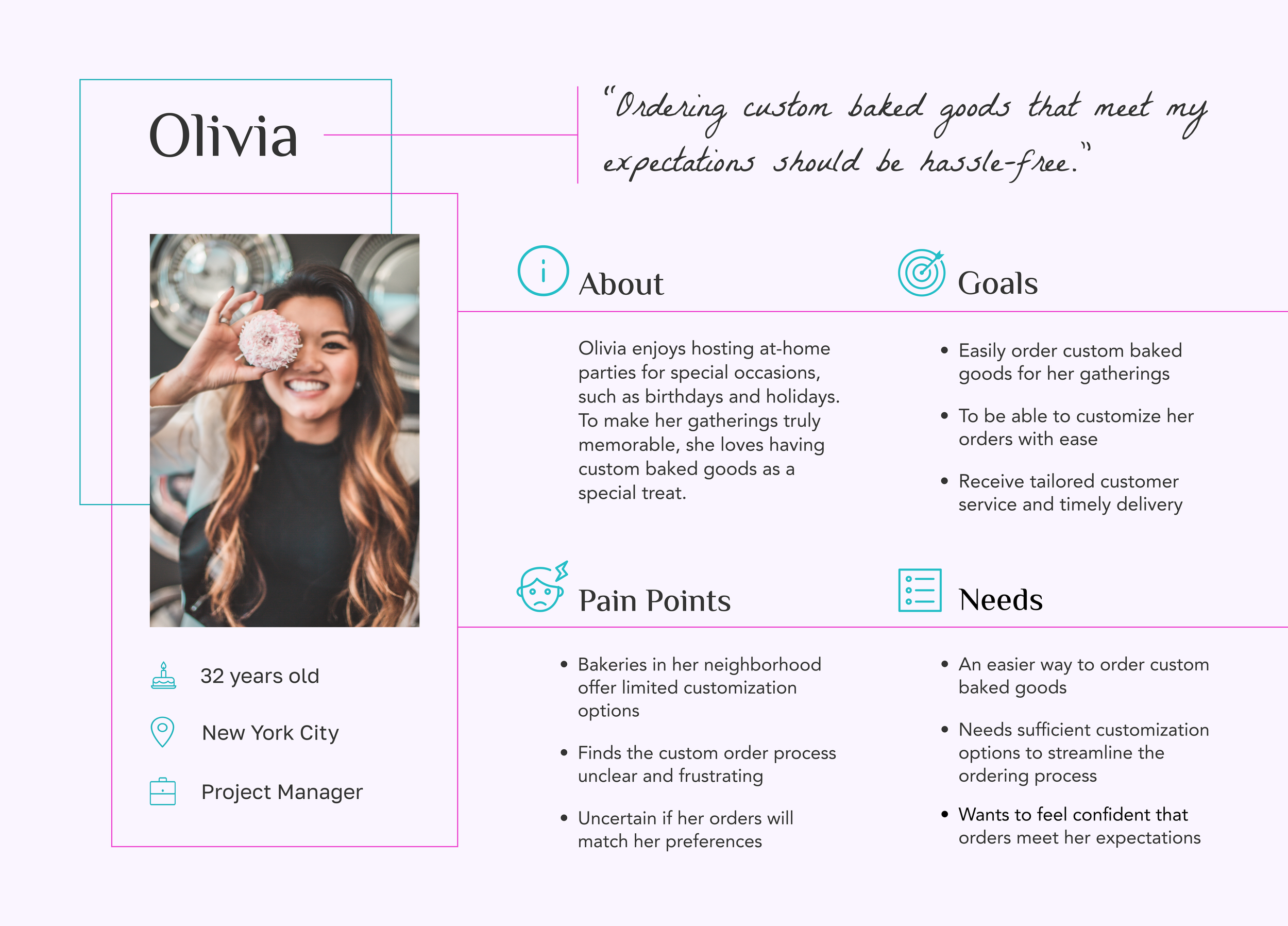
Persona
Addressing user’s needs and pain points
The persona represents our target audience, highlighting Olivia's struggle to find custom baked goods for her themed parties in local bakeries, leading her to turn to online baking businesses, and her preference for a seamless custom ordering process.
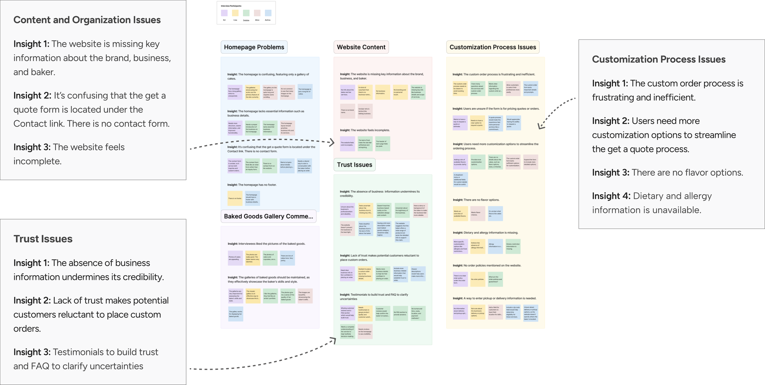
Affinity Mapping
What challenges do users face on the website?
I utilized affinity mapping to uncover clusters of patterns and key insights that highlighted issues users had with the website.
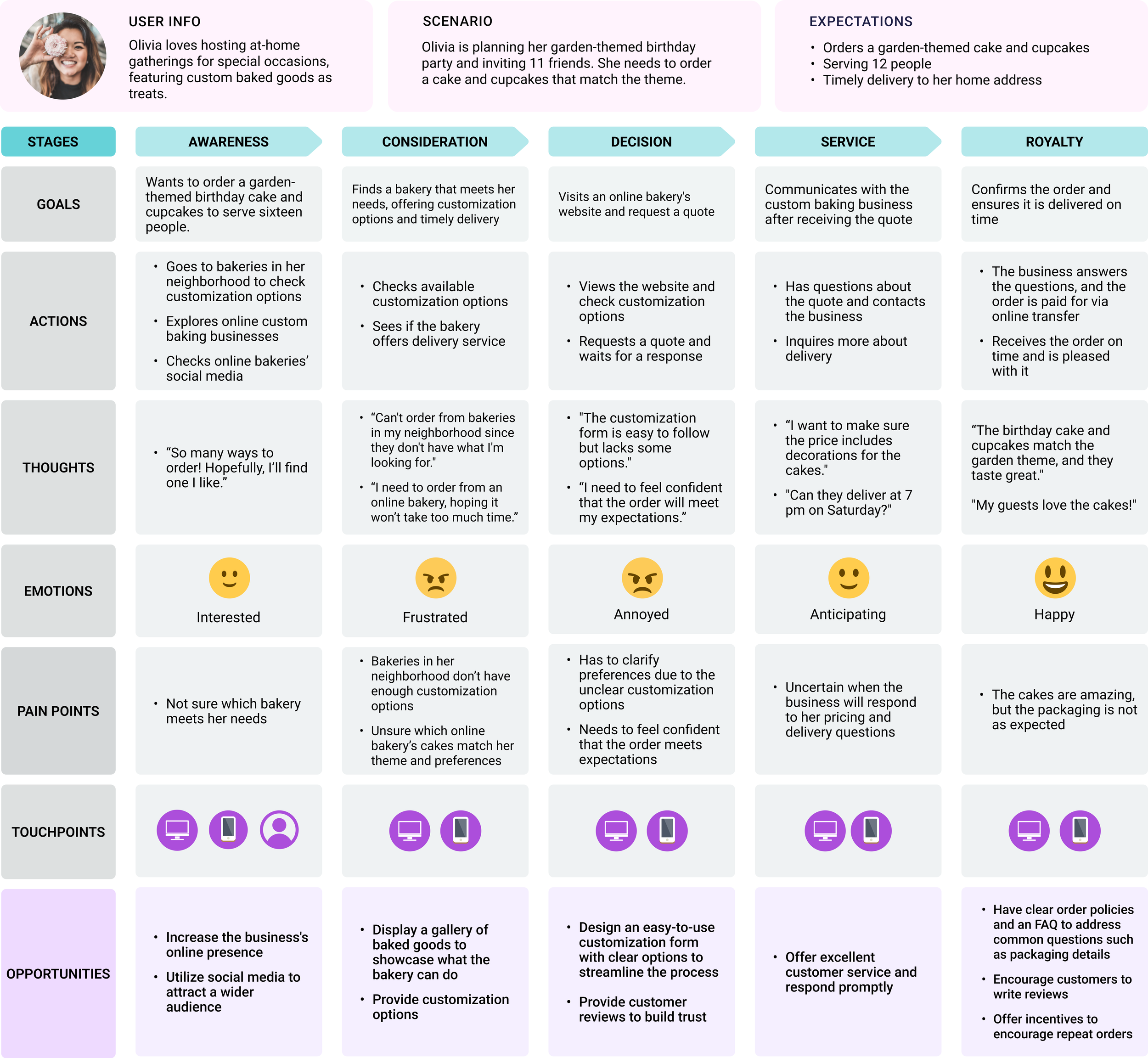
Customer Journey Map
A customer-centric approach
I created Olivia's customer journey map, detailing her experience buying custom baked goods online from awareness to post-purchase. This revealed the need to improve her experience by clearly presenting business offerings and enhancing the custom ordering process.
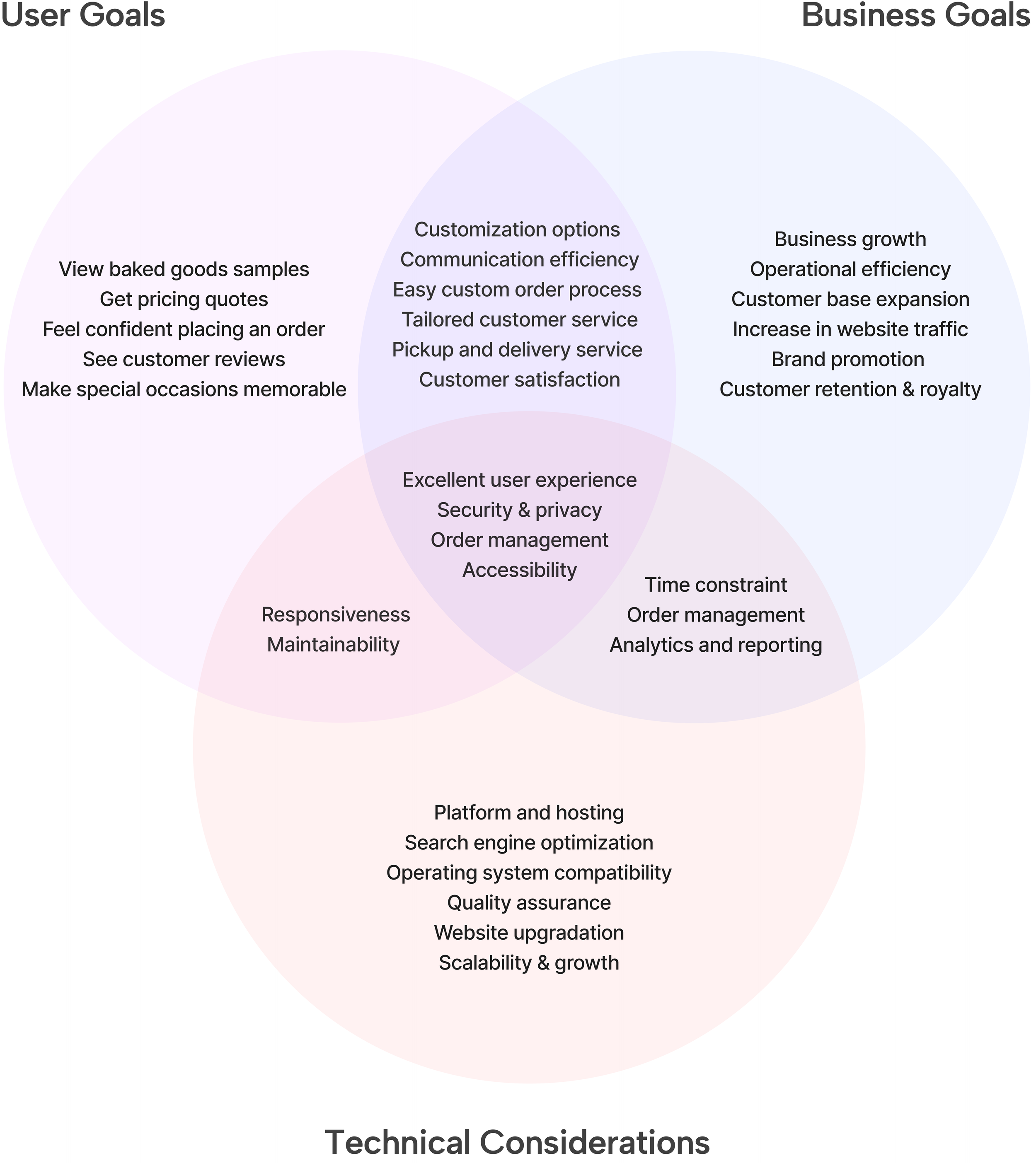
User Goals + Business Goals
Discussing user research insights with the client
I met with the client again to discuss user needs, align business and user goals, address potential technical issues, and finalize the website’s content and features before creating the sitemap.
IDEATE SOLUTION
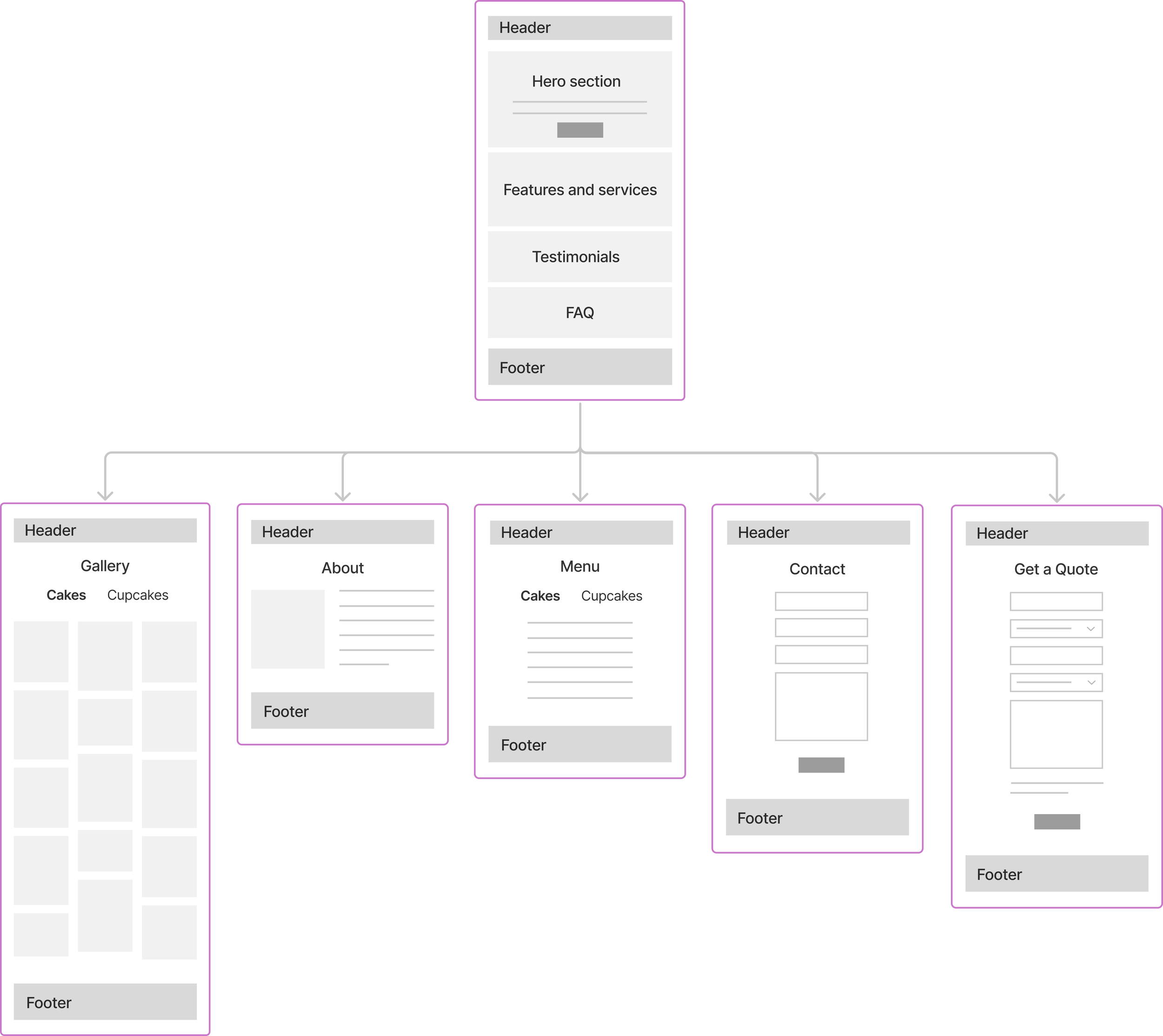
Sitemap
A visual sitemap for a clear overview
I presented this visual sitemap to the client, giving her a clear, easy-to-understand overview of the website's features, layout, and structure. We decided to move forward with this sitemap.
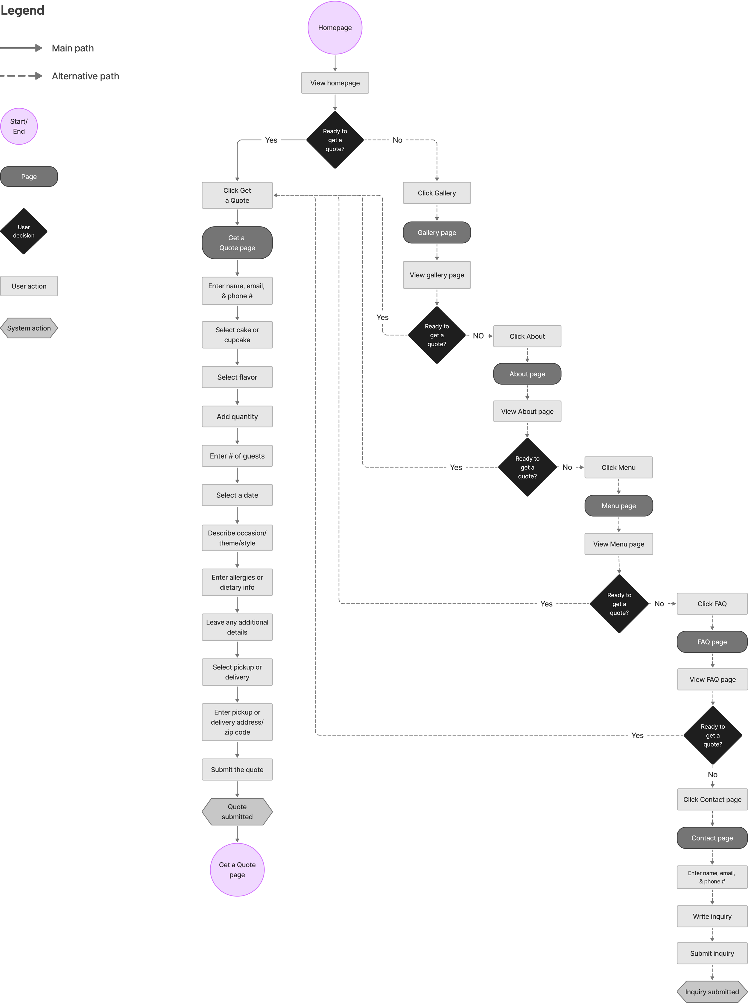
User Flow
How users interact with the new website
The main user flow is to learn about the business and request a customized quote. If users aren’t ready to request a quote, they can explore other features and submit a question via the contact form.
DESIGN
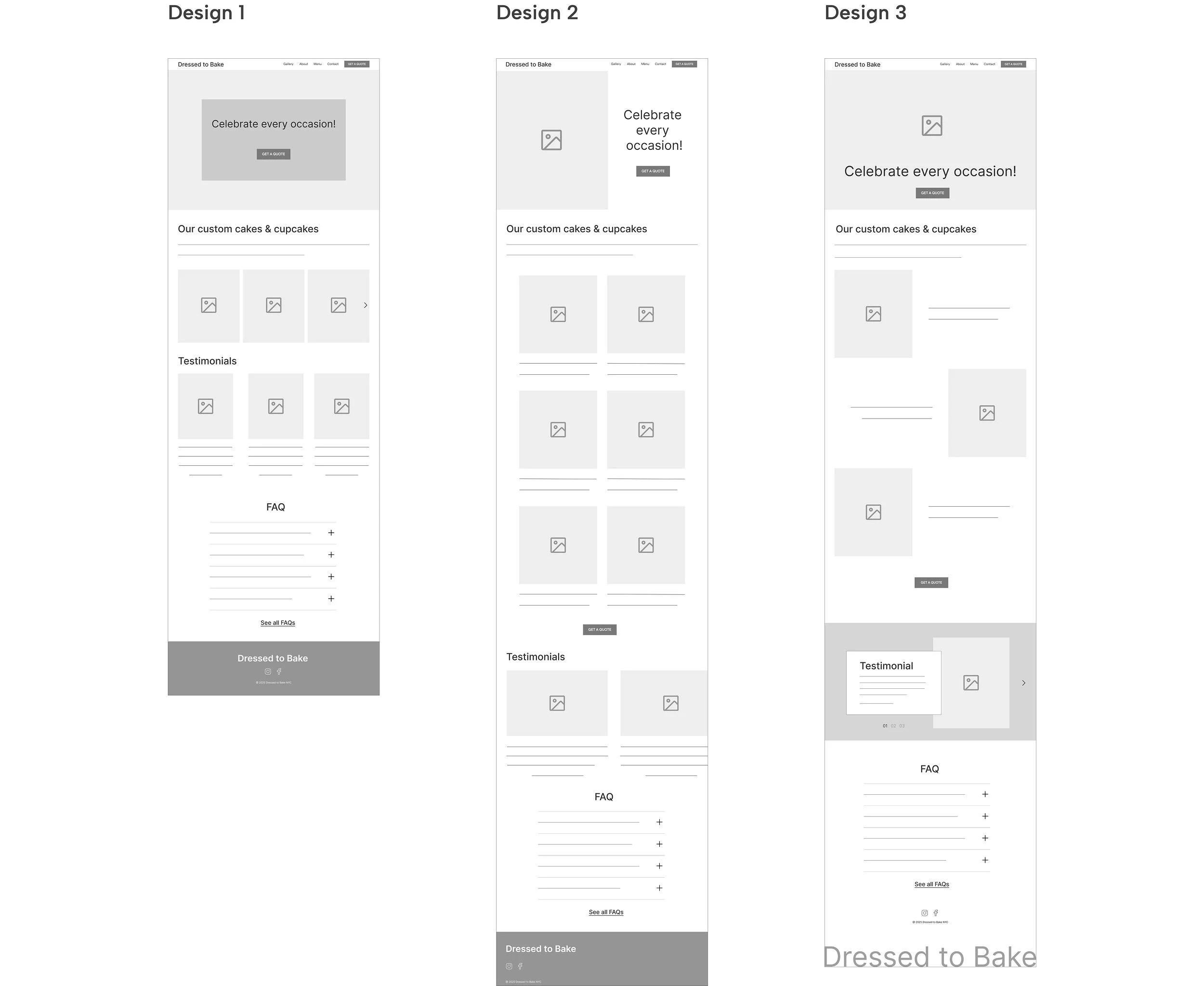
Creating a new homepage
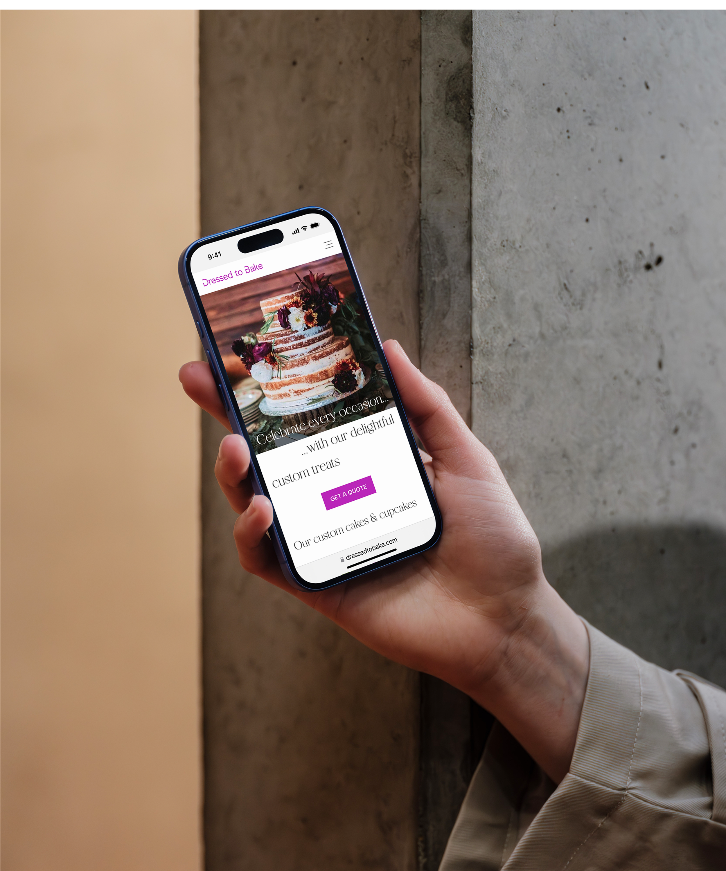
I designed 3 versions of the homepage for the client to review. As the main entry point, the homepage provides an overview, guides visitors, and sets the brand’s tone. I focused on this screen to ensure it reflected the brand's vision.
The client chose Design 3 for its contemporary feel, with the full-bleed hero section offering space to showcase her work or potentially feature a video in the future.
Lo-fi Wireframes
Conducting user & A/B testing
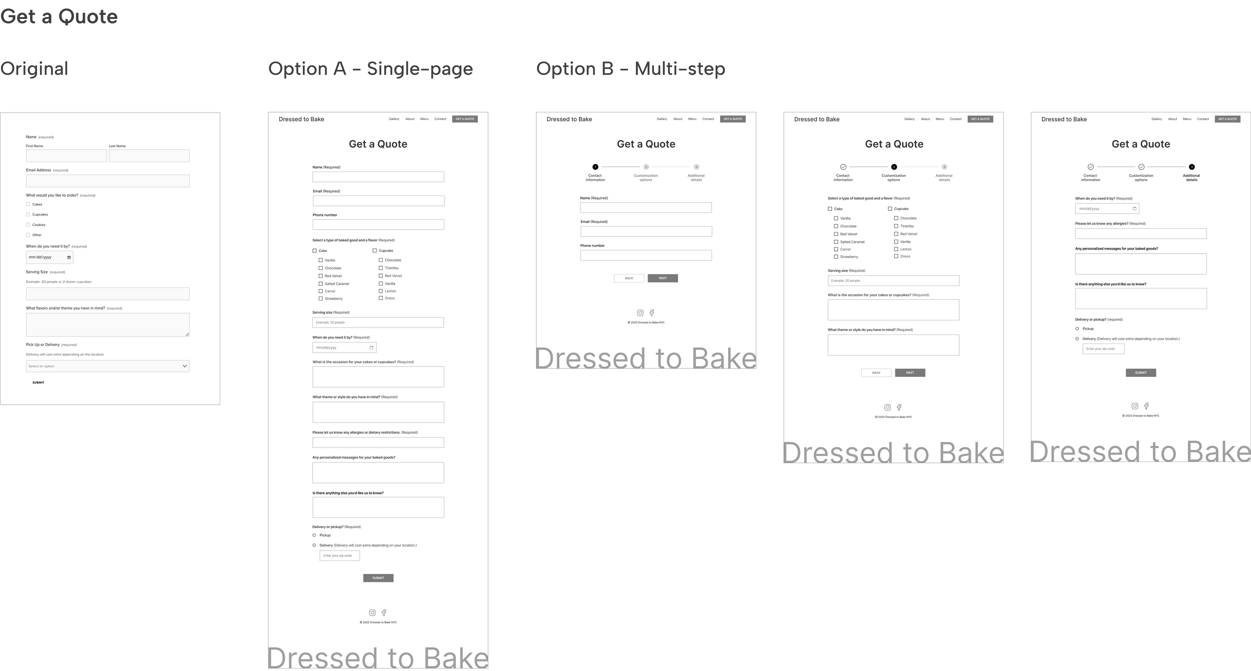
I created all screens and conducted user testing. The original Get a Quote form lacked essential details, so I enhanced it to improve usability and reduce drop-off. The form is important to both the client (to generate business) and customers (to receive pricing quotes). I designed a single-page and a multi-step form, and ran A/B tests to identify the better-performing version.
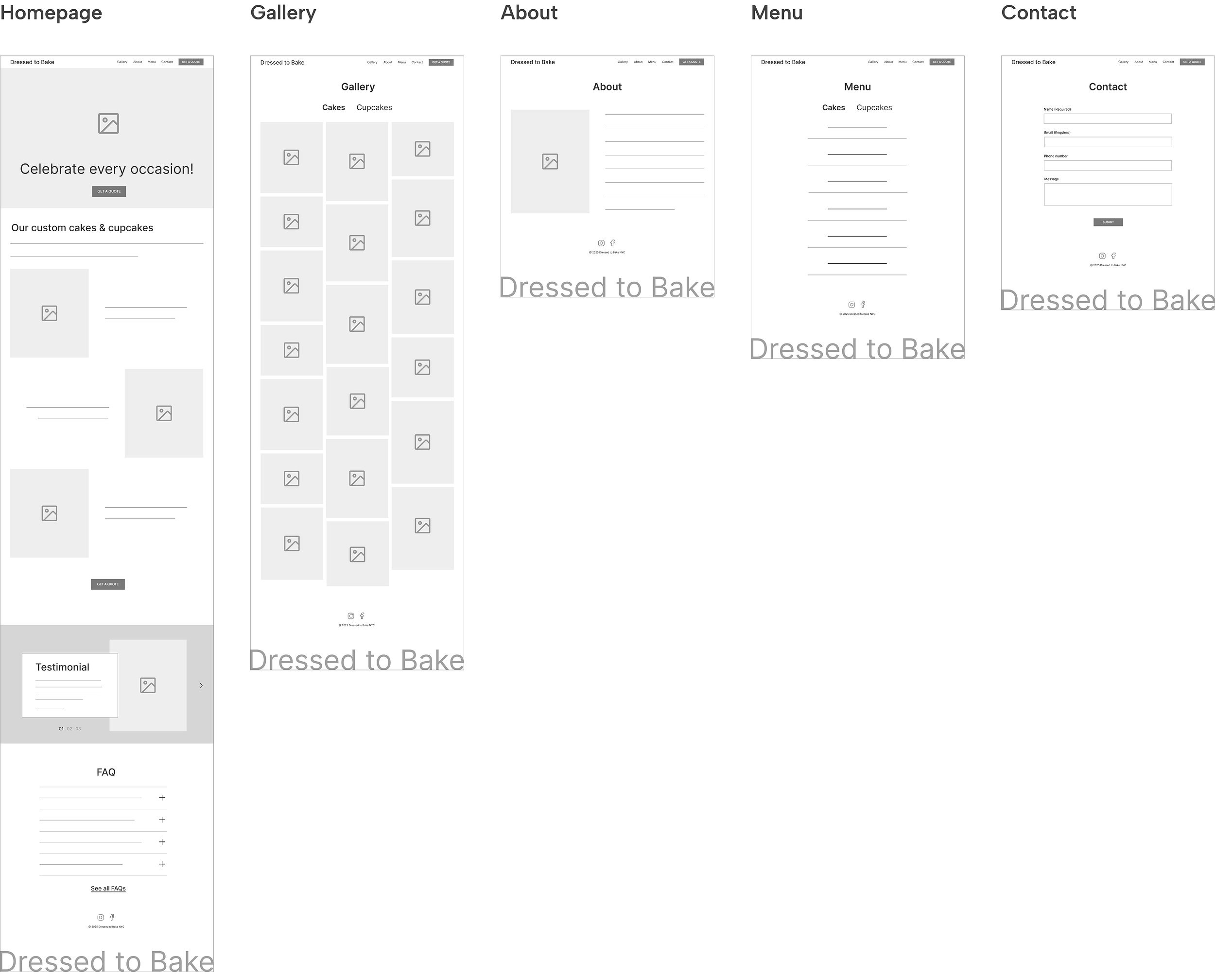
Initial Homepage Wireframes
Hi-fi Wireframes
Enhanced website clarity
I created hi-fi wireframes that provided a detailed representation of all screens, enhancing the design's clarity and helping both the client and users better understand the interface.
Moodboard & Style Guide
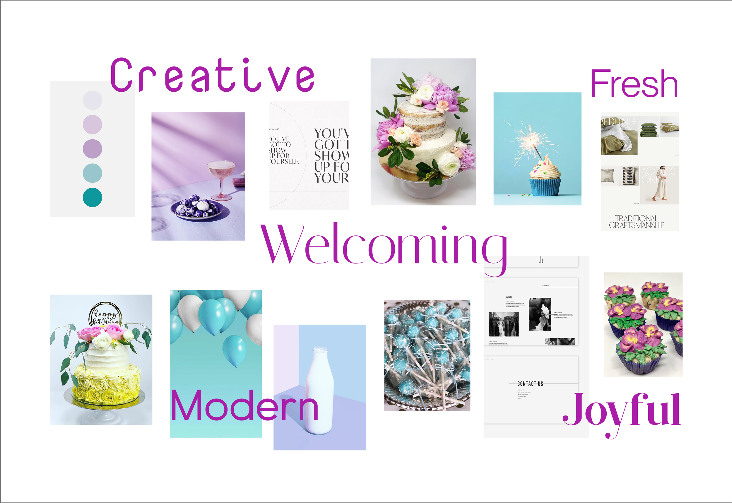
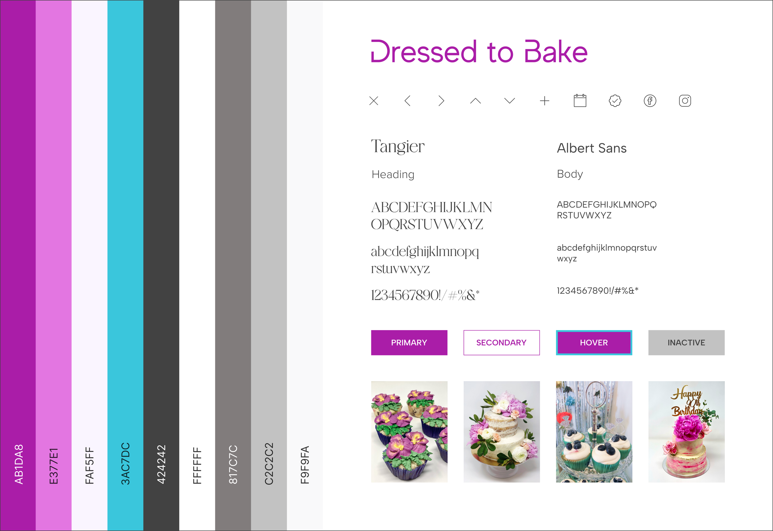
New branding to align with brand values
The client envisioned her website as fresh, modern, creative, joyful, and welcoming - values that represent her brand. I chose a unique text-only logo, contrasting contemporary fonts, and a color palette inspired by the vibrant hues of her baked goods to achieve a joyful, fresh, and modern look.
A/B test results: Option A is the preferred form
With Option A as the preferred form, I then refined the single-page layout by using dropdowns for flavors and adding brief instructions to help customers complete the form faster and easier.
Users preferred Option A because they liked seeing all questions at once, avoiding back-and-forth.
18 participants:
11 chose Option A
7 chose Option B
The client also favored Option A, believing it encourages more form completions.
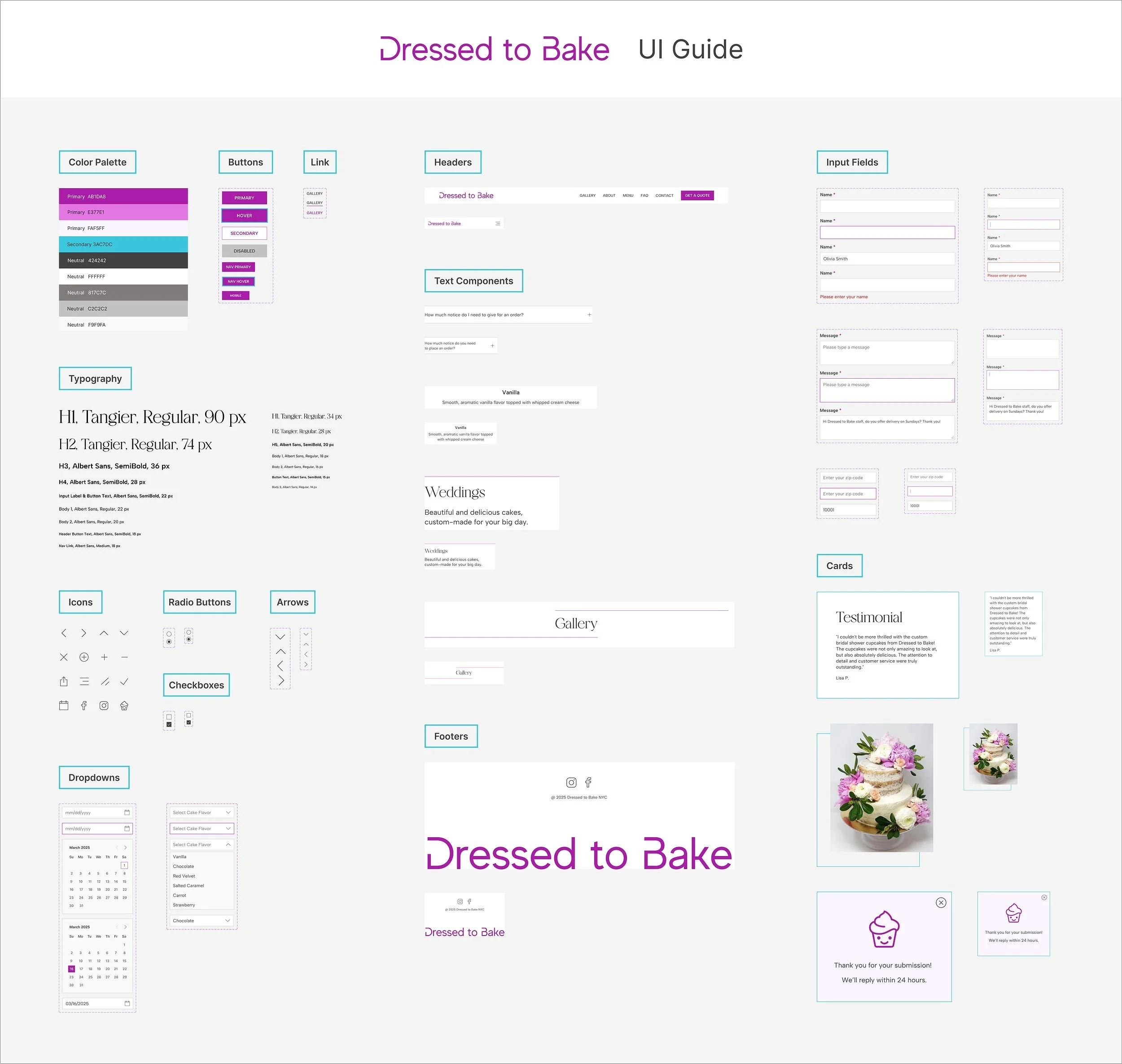
UI Guide
Design guide for consistency and future updates
The UI guide includes a color palette, icons, typography, and components designed to streamline development and ensure a consistent user experience across platforms. It also serves as reference to future updates for the client.
TEST &
ITERATE
User Testing
Evaluate and improve
I conducted usability testing with 8 participants on the Lyssna platform to evaluate the design, identify issues, and pinpoint areas for improvement.
User testing tasks:
How confident do you feel about choosing this business for custom baked goods after exploring the website? (1-5, with 5 being very easy)
Average rating: 4.2 (This rating for the original website: 1.8)
Fill out and submit the Contact form.
Task success rate: 100%, average time spent: 23s.
Fill out and submit the Get a Quote form
Task success rate: 100%, average time spent: 91s.
Success Metrics
What went well?
Areas for improvement
1. Added a social media feed to the homepage and repositioned the FAQ
2. Simplified the Get a Quote form for easier completion
How easy is it to use the customization options in the Get a Quote form?
(1-5, with 5 being very easy)
Average rating: 4.4
(Original site rating: 2.2)

How easy is it to find the information you’re looking for?
(1-5, with 5 being very easy)
Average rating: 4.6
(Original site rating: 2.0)
How would you rate your satisfaction with using this website?
(1-5, with 5 being very satisfied)
Average rating: 4.5
(Original site rating: 2.6)
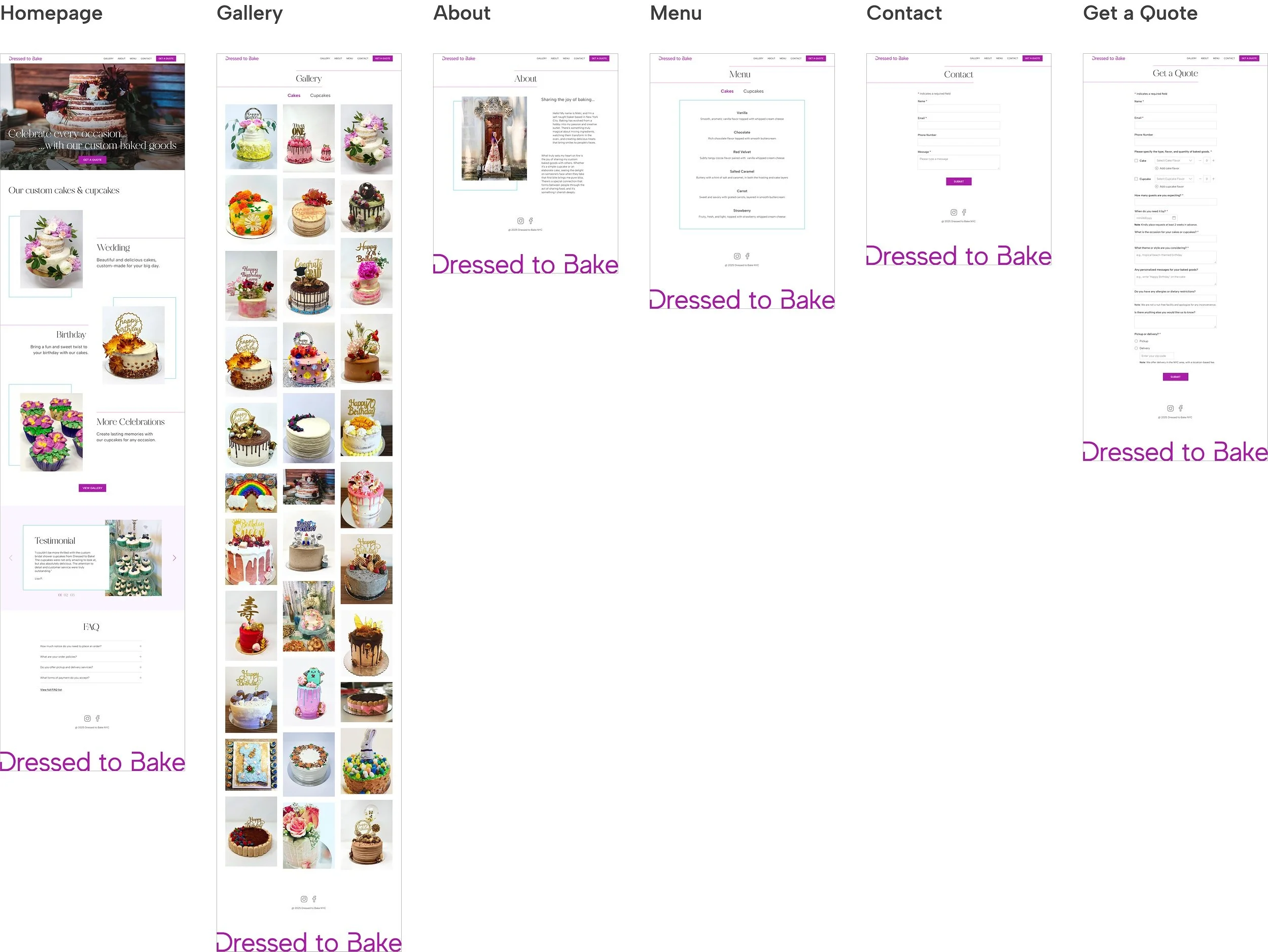
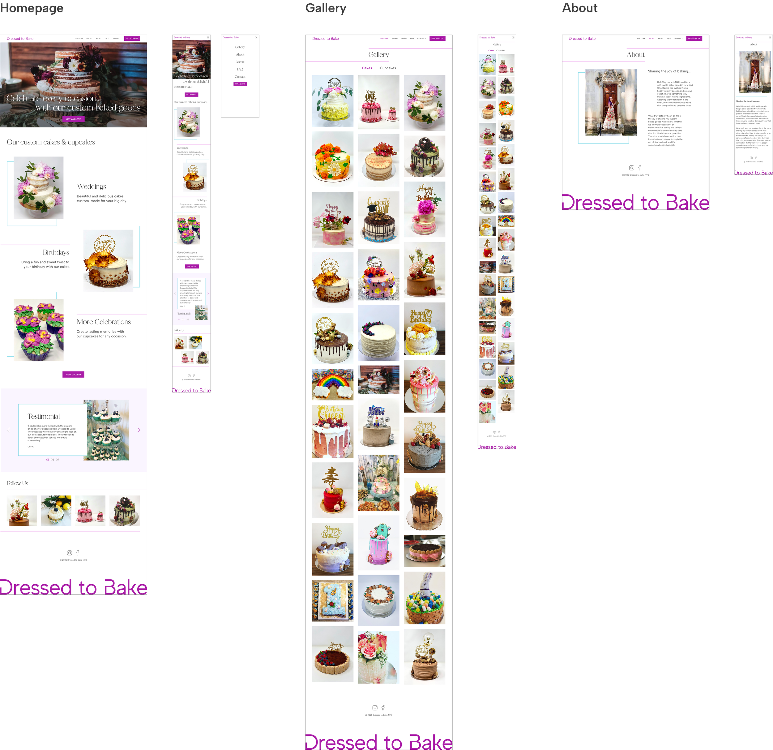
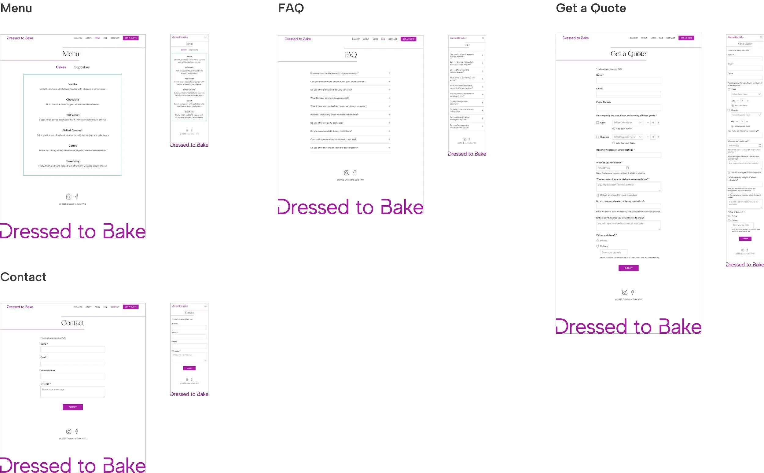
Final Prototype
Final Design
Optimizing for desktop and mobile
I designed both desktop and mobile versions to present to the client, ensuring that the layout and user experience are optimized for different screen sizes and devices.
REFLECTION
Next Steps
SEO optimization: enhance website content to improve search engine rankings, boost visibility, and drive more traffic.
Implement the design on the client's existing Squarespace site for easy self-updates. If some elements are incompatible, we may need to hire a developer.
Lessons Learned
Balancing creativity with usability. While aiming for an appealing design, I prioritized an intuitive user experience, especially the get a quote form of the custom ordering process, to convert visitors into customers.
Client collaboration is key. Understanding their vision, goals, and brand identity, along with regular communication, ensured the design met both aesthetic and functional needs.