We transformed the website to be professional, user-friendly, and trustworthy, making it easier for seniors and their families to understand the product and shop with confidence.
Timeline
4 Weeks
Project Type
Client Project
Stakeholder: CEO
(Live Website)
Team
3 UX/UI Designers
3 Developers
Skills
UX/UI Design, User Research & Interview, Ideation, IA, Branding, Design System, Wireframing, Prototyping, User Testing
Tools
Figma
FigJam
Otter.ai
Google Meet
OVERVIEW
Background
VanTech Med is a Canadian startup dedicated to improving the lives of vulnerable seniors through AI and robotics. Its core product, Sundae (formerly named Sunny), is an AI-powered companion doll designed to alleviate social isolation and loneliness among the elderly.
SundaeDoll’s existing website struggles to balance technological functionality with commercial presentation, lacking both detailed information and trust-building elements. A cluttered homepage, poor navigation, and usability issues further disrupt the user experience, reducing customer engagement and ultimately harming sales and brand loyalty.
Problem
Our design team was tasked with redesigning the SundaeDoll website within a tight 4-week timeline. The project involved significant updates to the website’s design, navigation, layout, branding, content, and usability.
We redesigned existing pages, such as the homepage and product page, and created new pages, including Meet Sundae, About Us, and Research, to present essential information, improve user experience, and build trust with customers.
Solution
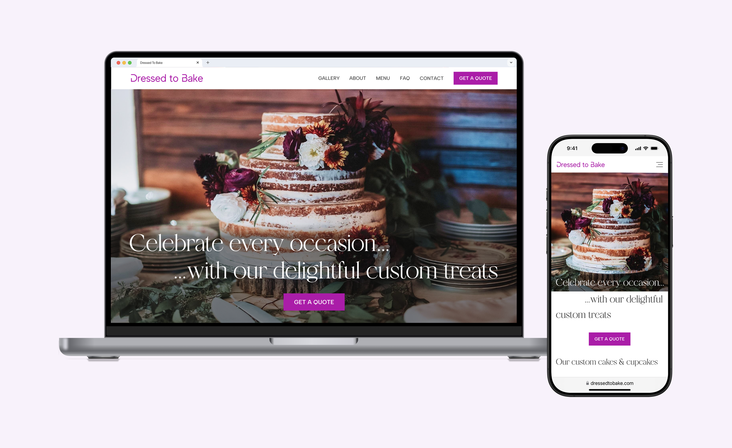
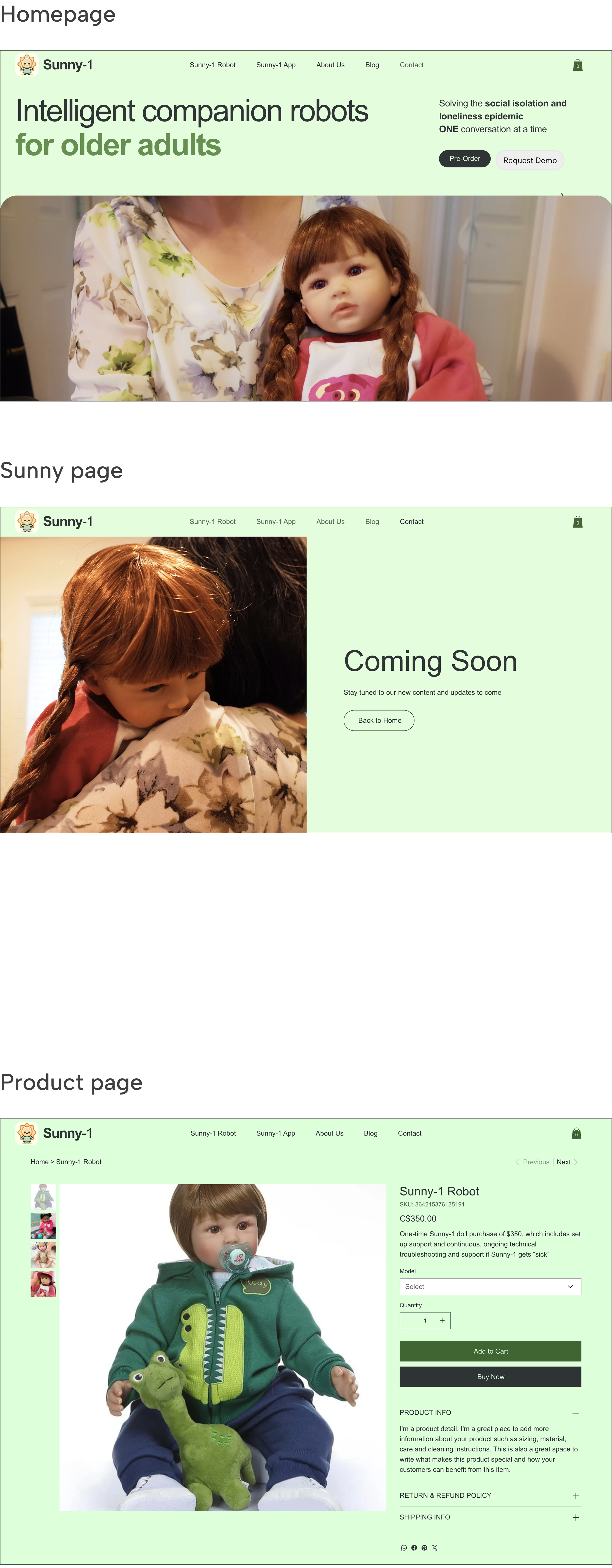
Before
After

RESEARCH
What’s wrong with the existing website?
Project Kickoff
From our kickoff meeting, we gained insights into the stakeholder's perspective:


After meeting with the stakeholder, we conducted a deeper analysis through a heuristic evaluation using the Nielsen Norman Group's 10 usability heuristics to identify usability issues. Here are the findings that we presented to the client:
Diving deeper to identify the website's usability issues
Heuristic Evaluation

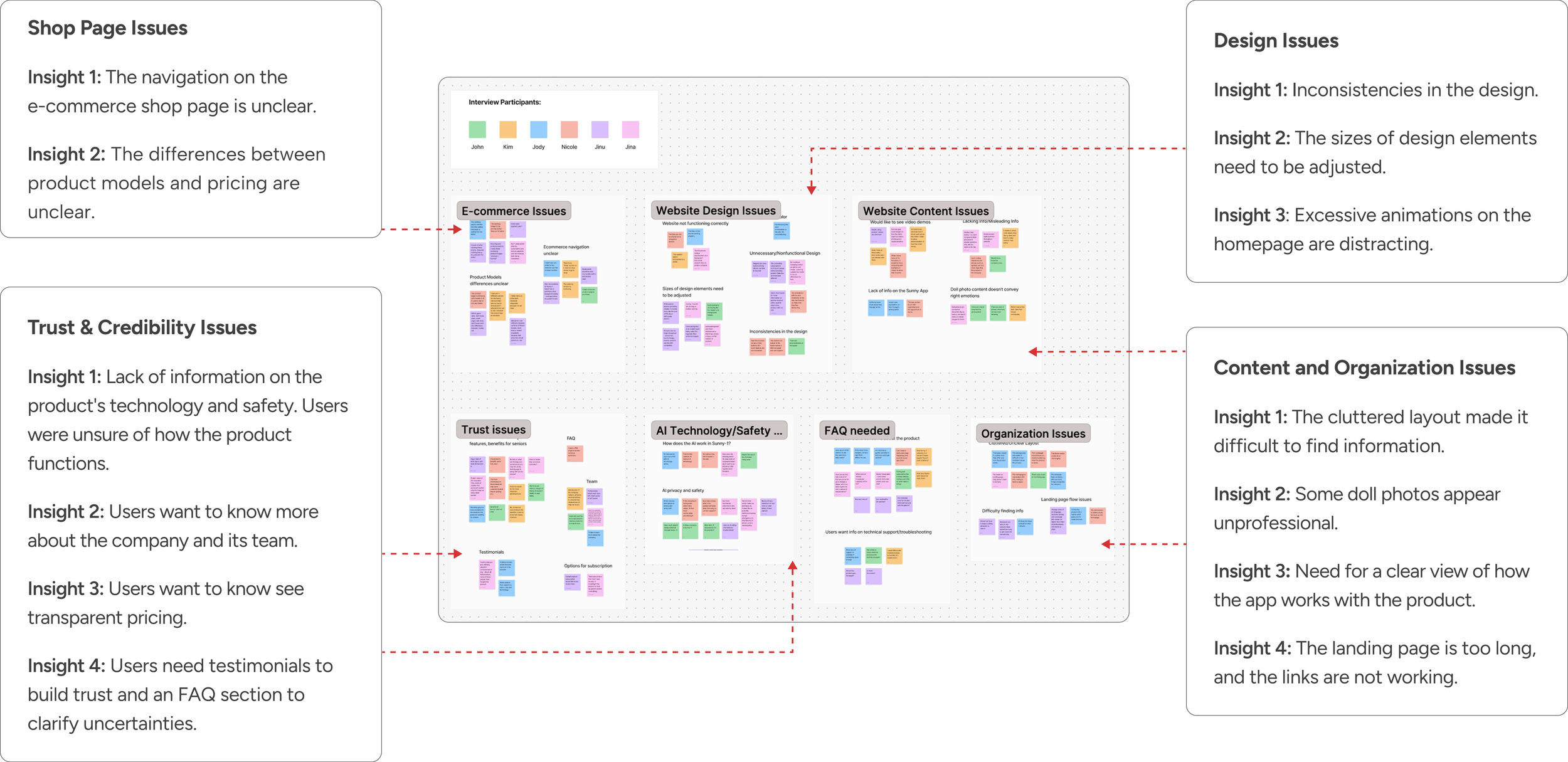
User Interviews
What problems did users encounter on the website?
We interviewed 6 potential customers, family members of seniors, to understand their issues and validate the heuristic findings. We performed affinity mapping, keeping the client’s issues with the website in mind, and we identified four key areas for improvement:
1. Design
2. Content & organization
3. Shop page
4. Building trust and credibility
Direct competitors’ approaches in these 4 key areas
Competitor Analysis
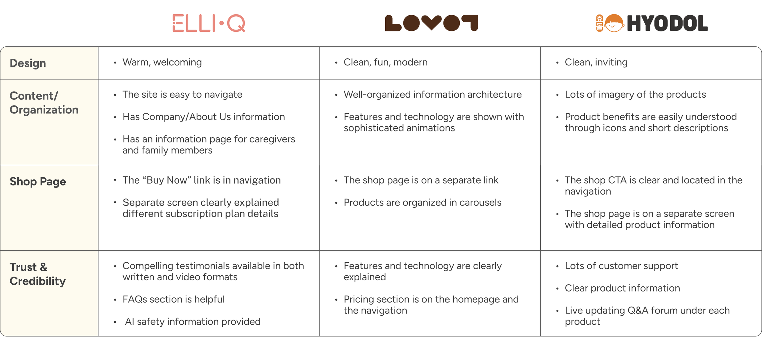
To address the issues identified by users, we analyzed 3 direct competitors to understand their approaches. This helped us to discover potential solutions to these challenges.
DEFINE
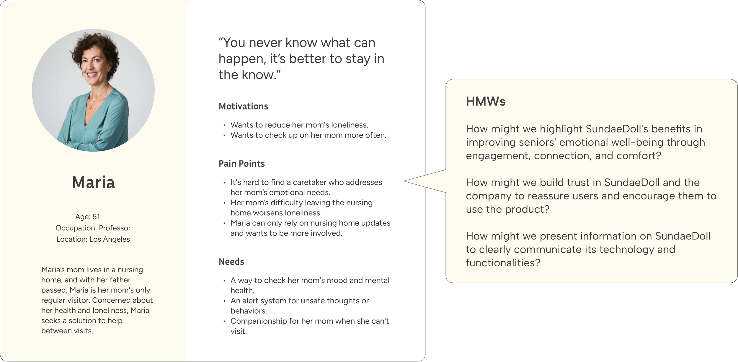
Our target users include family members of seniors who cannot be with their loved ones and are seeking solutions for companionship and the ability to check on them.
Who are our target users and how might we help?
Persona
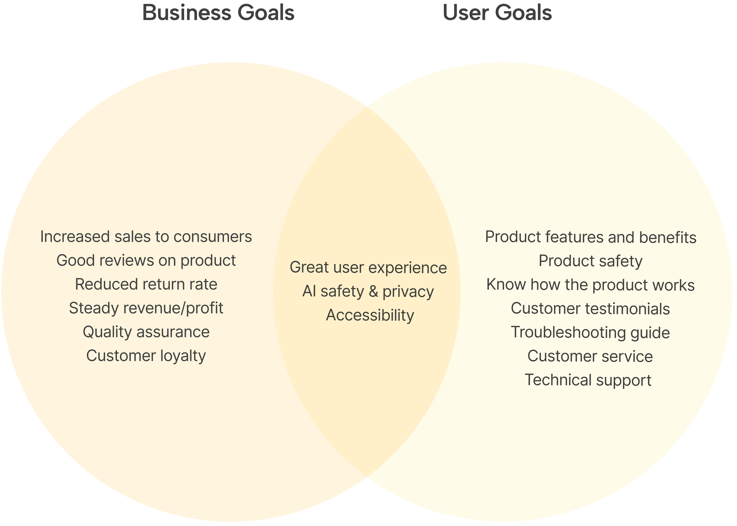
Business Goals + User Goals
After user research and defining the persona, we discussed with the stakeholders to align business and user goals.
Aligning business and user goals
Feature Prioritization
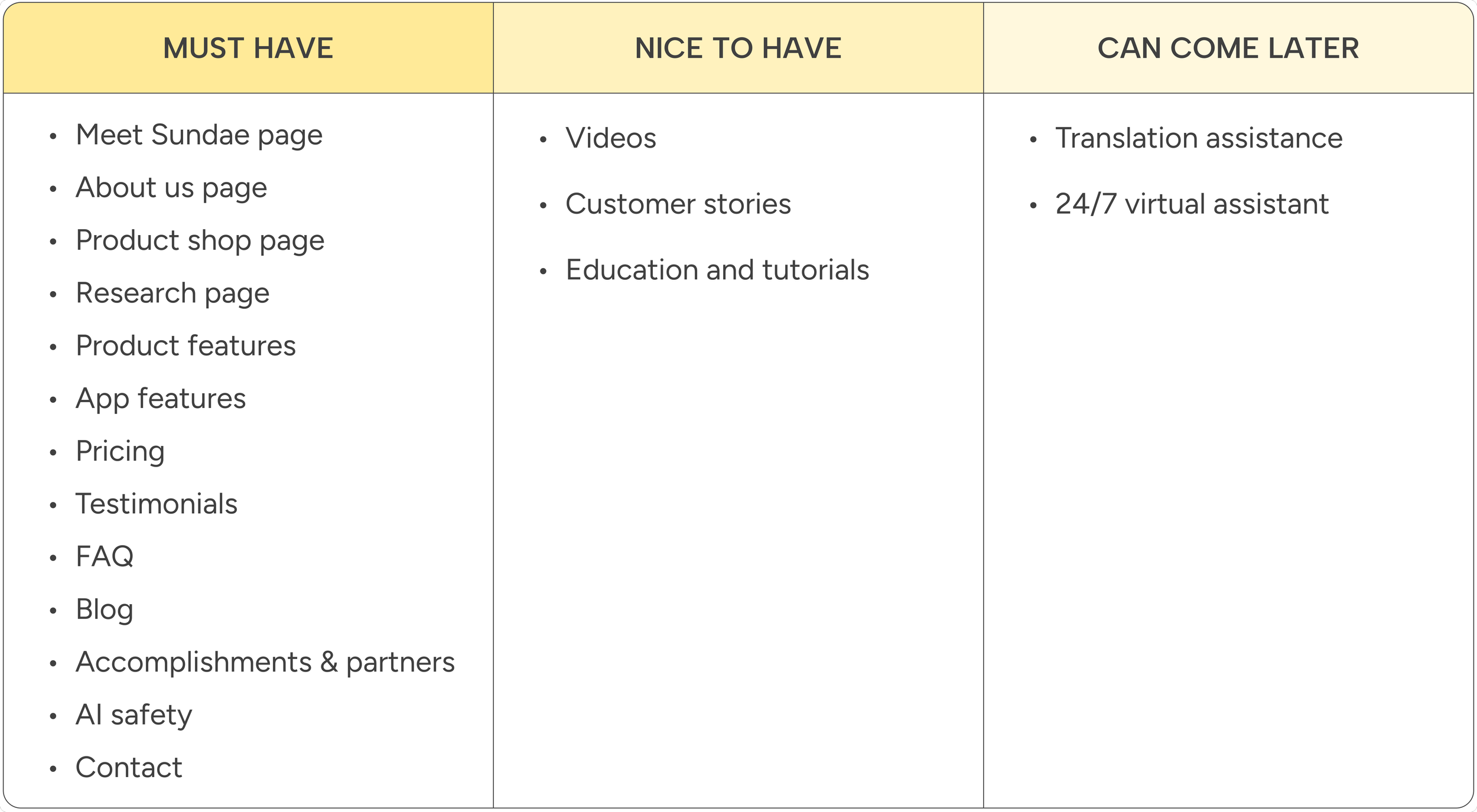
Considering the four key areas for improvement, as well as user and business goals, we confirmed the must-have features with the stakeholder to finalize the features for the new website.
Finalizing must-have features
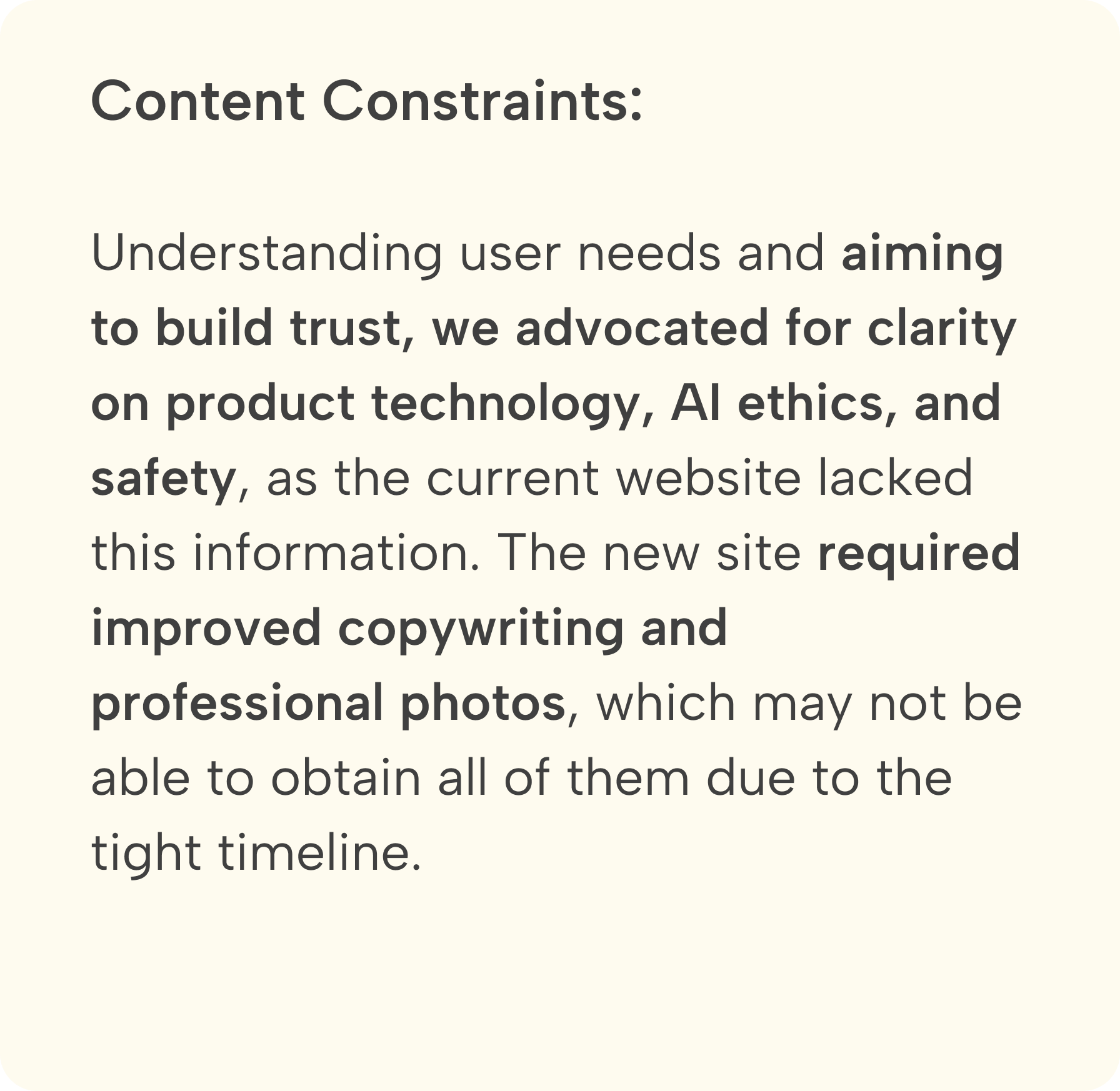
Midpoint Review
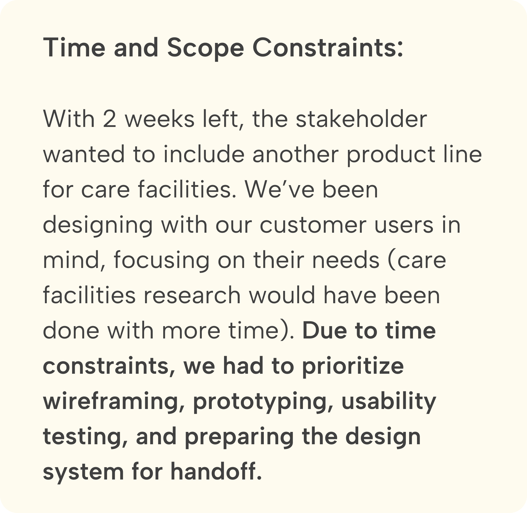
The changes and constraints

IDEATE
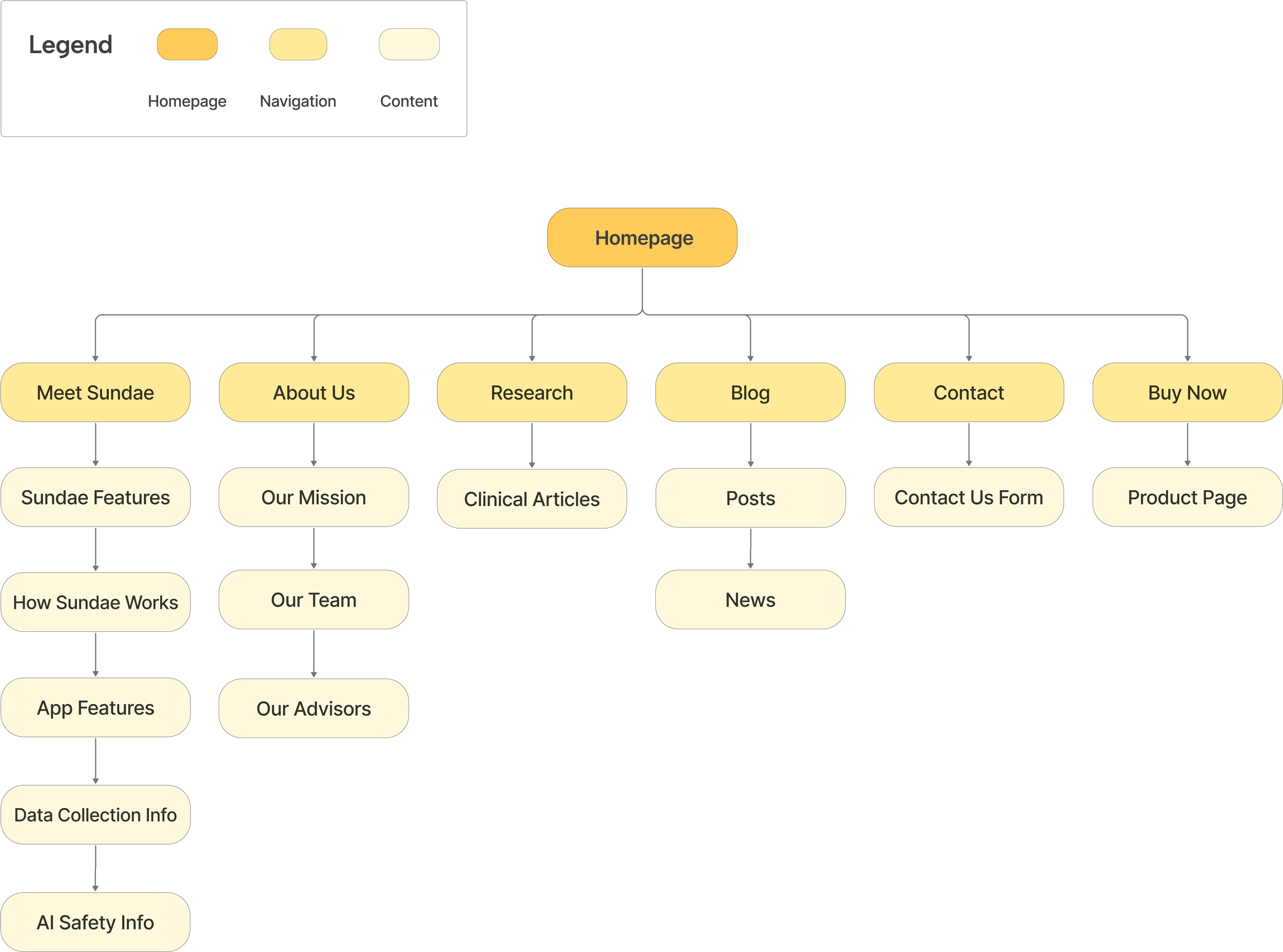
Information Architecture
A new sitemap with functional navigation links
We created this new sitemap after confirming the must-have features. The old website's navigation links were underdeveloped, so we focused on designing the Meet Sundae, About Us, Research, and Buy Now pages to maximize impact within the 2-week timeframe.
Mapping user interaction with the new website
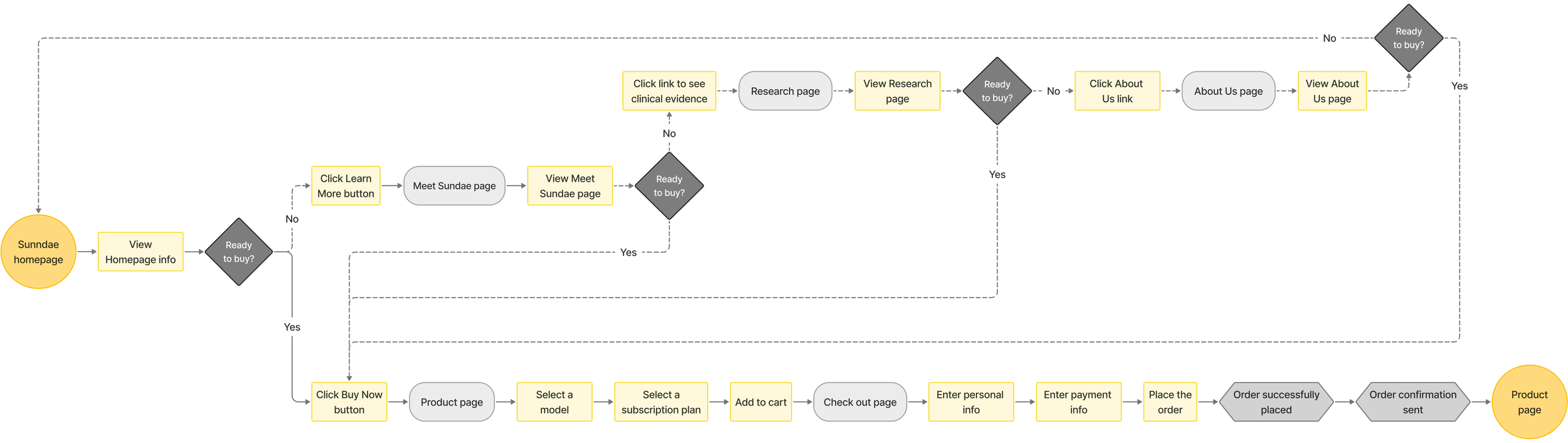
User Flow
The user flow illustrates how users navigate the website to learn about Sundae and make a purchase.
DESIGN
Overview:
1. Design: a style guide to ensure consistency and enhance usability.
2. Content & organization: improved content organization and a new navigation.
3. Shop page: clear product details, plans, and pricing in a streamlined layout.
4. Trust & credibility: new Meet Sundae, About Us, and Research pages.
How did we tackle the 4 key areas for improvement?
Solutions
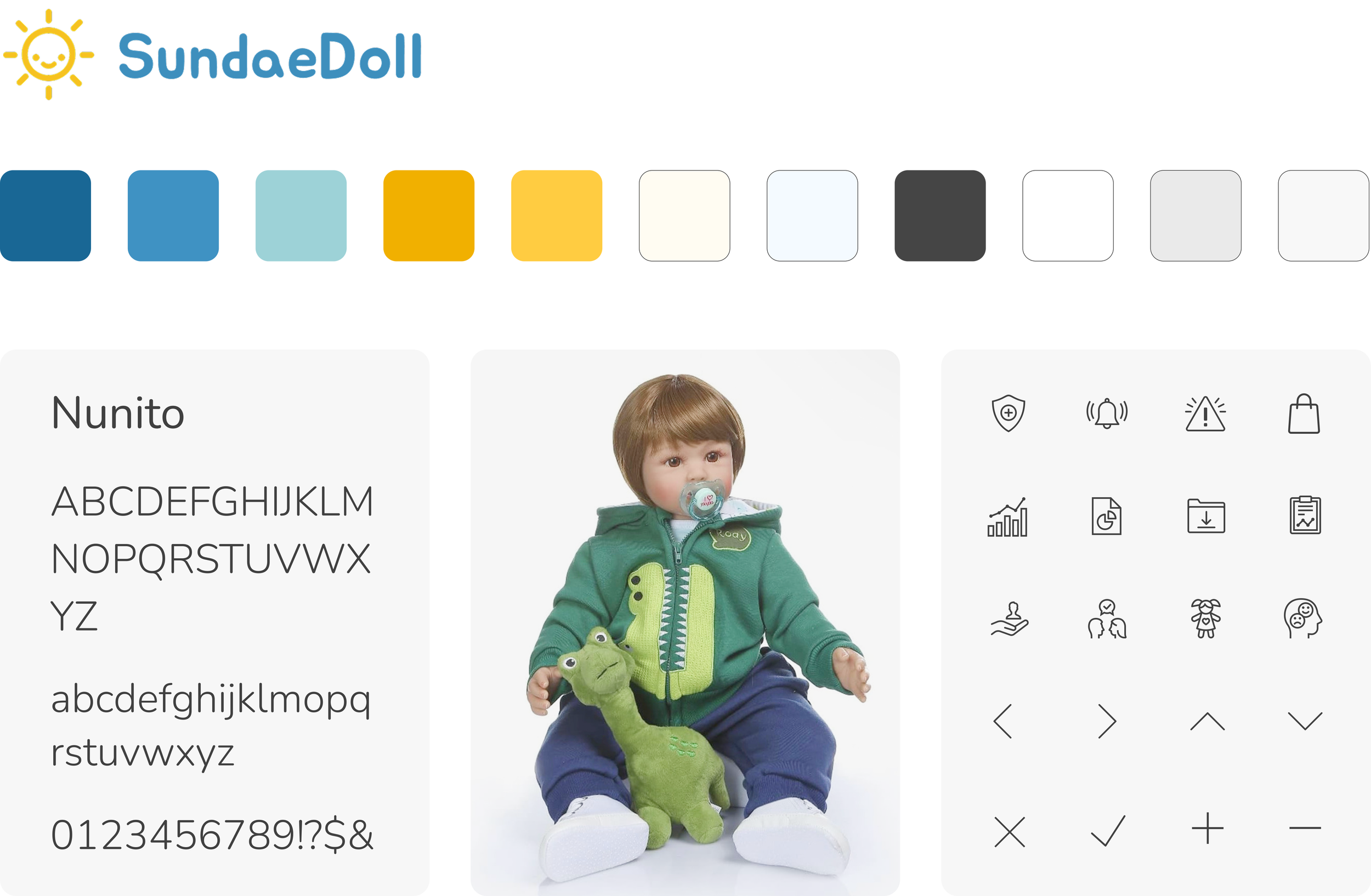
The redesign vastly differs from the original. With the logo, font, and only two primary colors blue and yellow provided, we created the style guide, expanded the color palette, and selected icons to align with the brand's professional yet friendly aesthetic. The team communicated and collaborated regularly to ensure design consistency.
1. Design
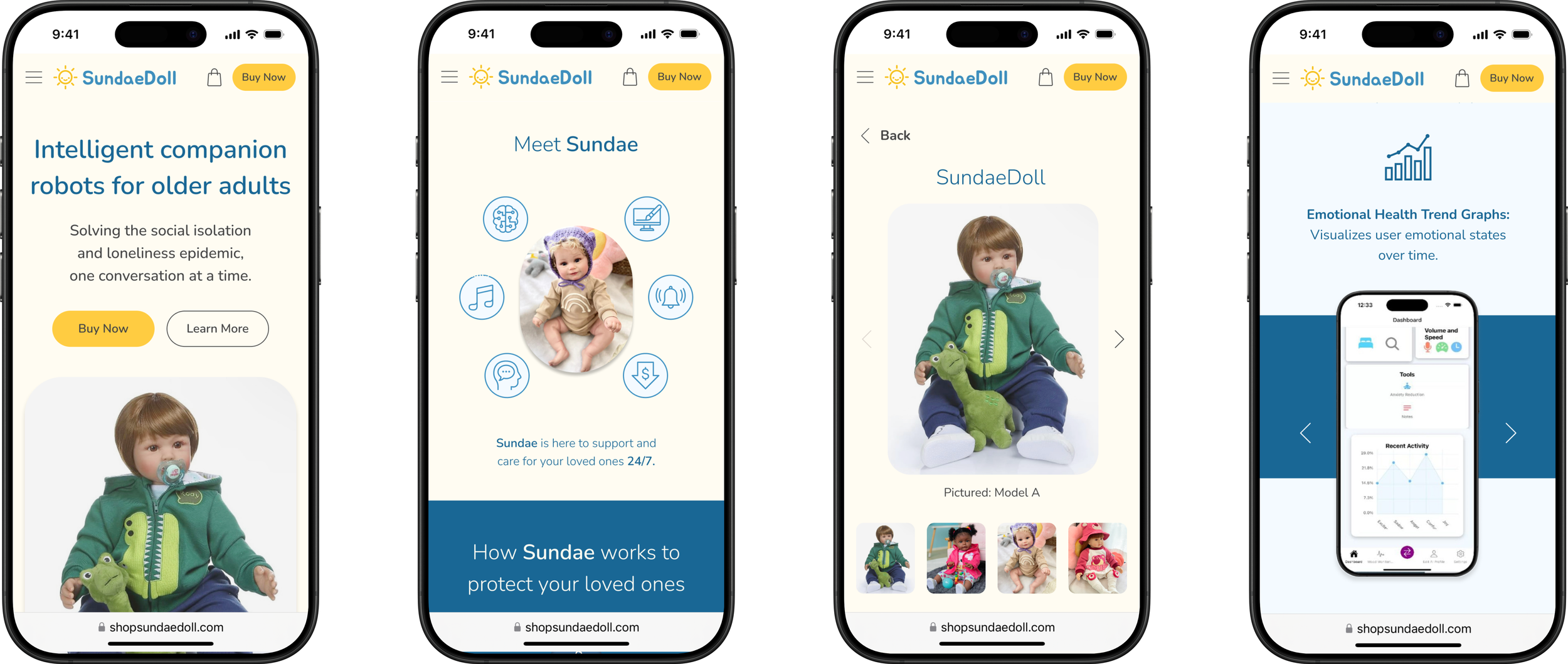
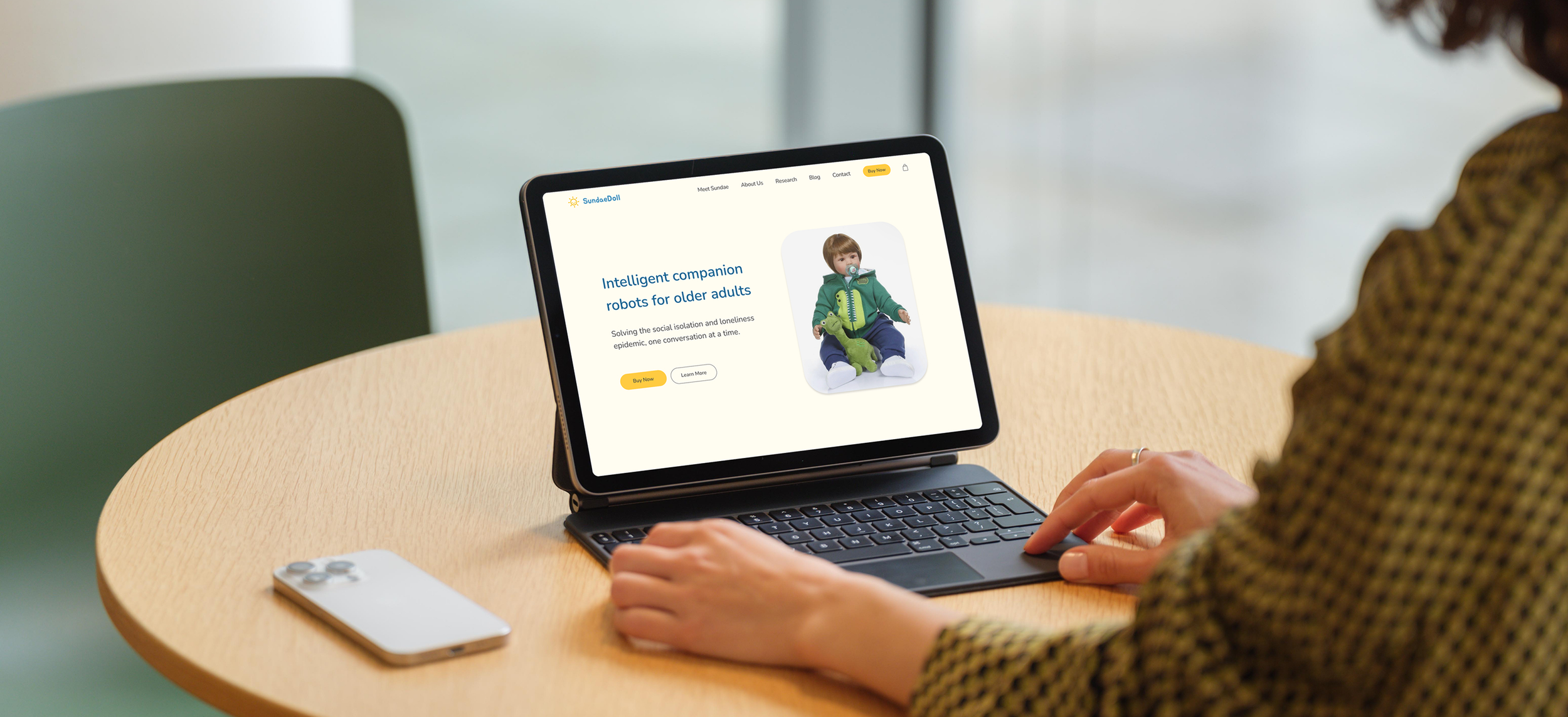
I contributed to the homepage design and ensured consistency across different screens. The homepage showcases Sundae, featuring a clean, user-friendly design with streamlined navigation to help users easily access information. The layout highlights Sundae’s key features and product details, ensuring a seamless browsing experience.
2. Content & organization
Lo-fi
Hi-fi

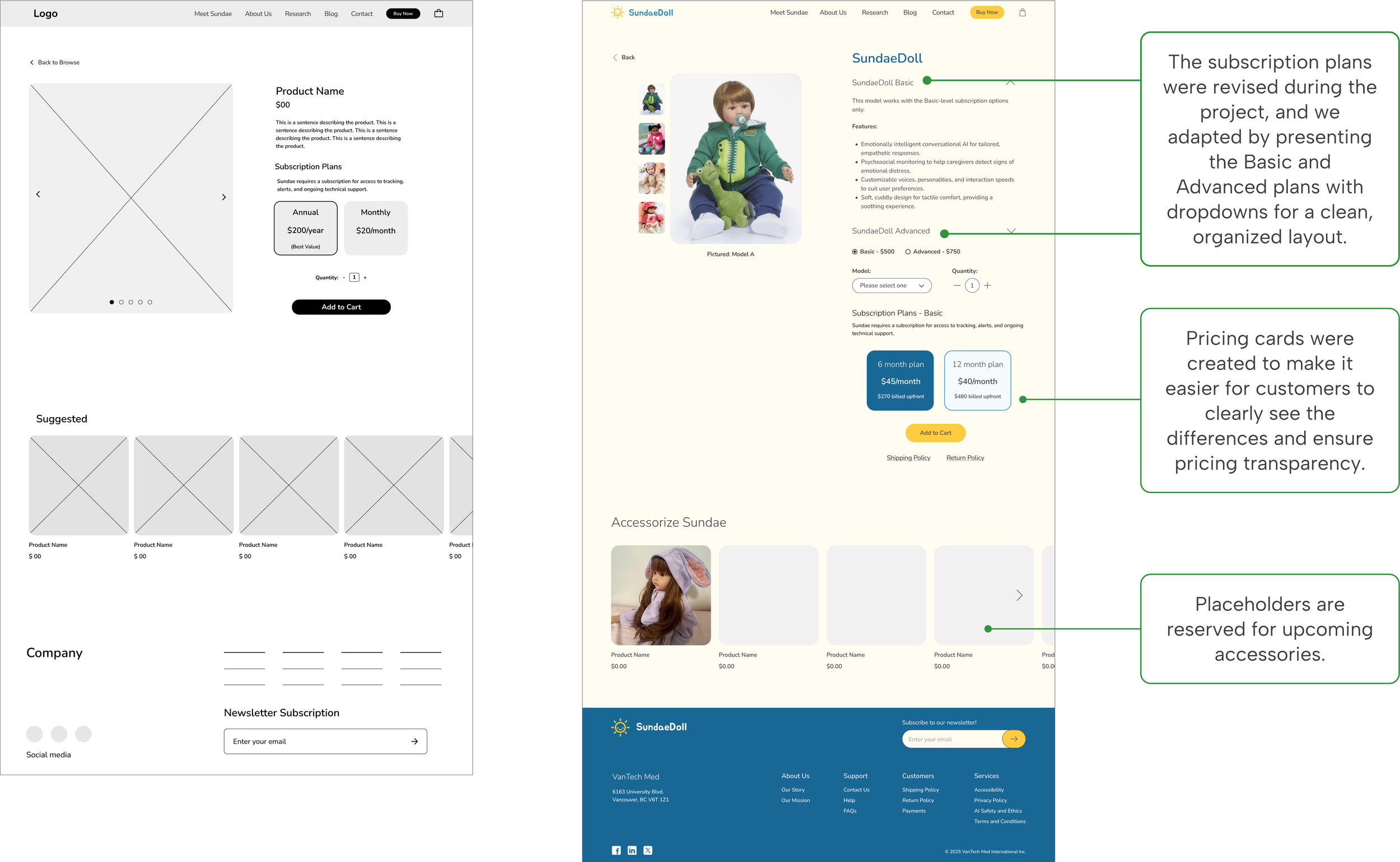
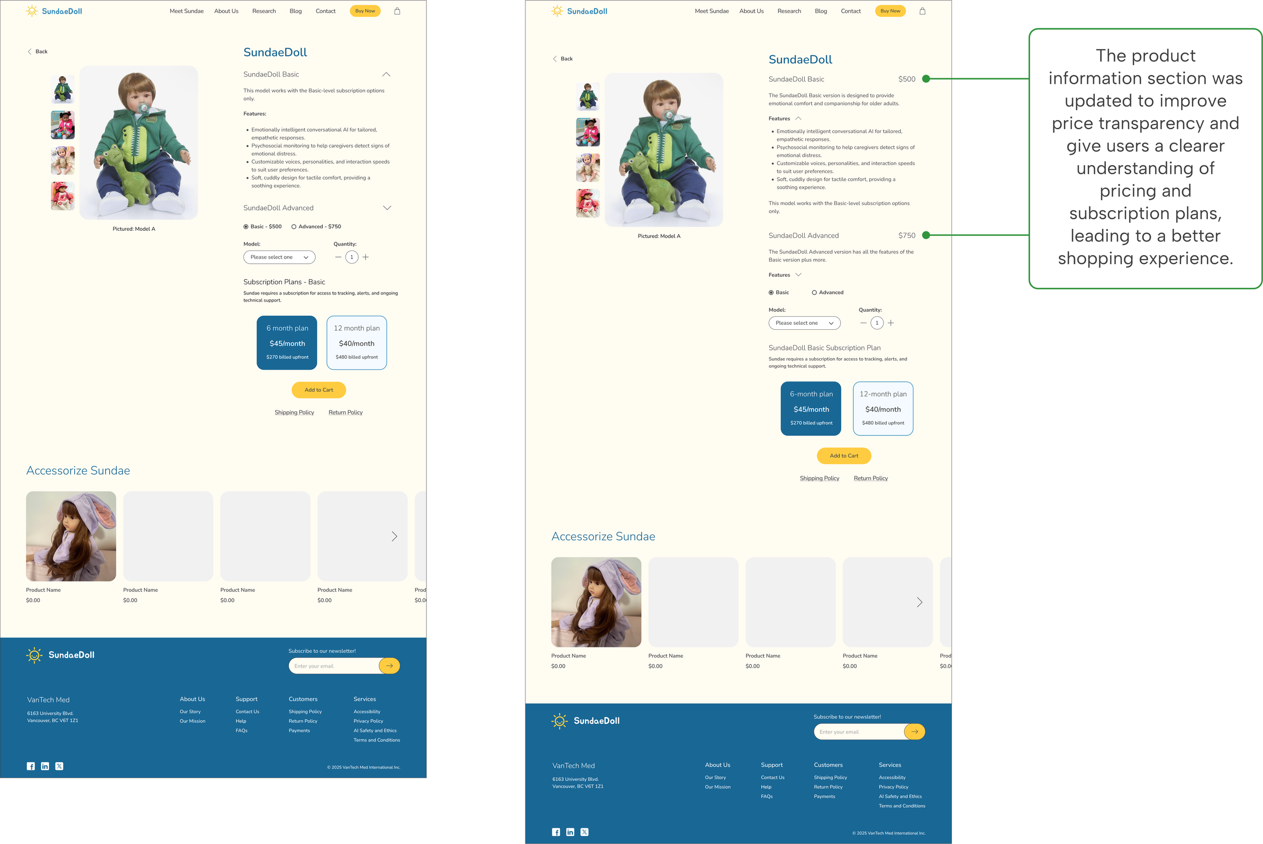
For the shop page, we enhanced the clarity of product details, plans, and pricing by organizing the information in an easily digestible format. We introduced clear headings, bullet points, and a streamlined layout to help customers navigate the shop page.
3. Shop page
Lo-fi
Hi-fi
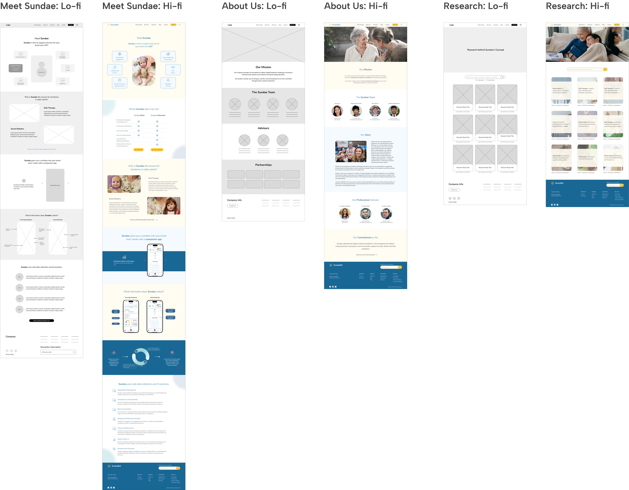
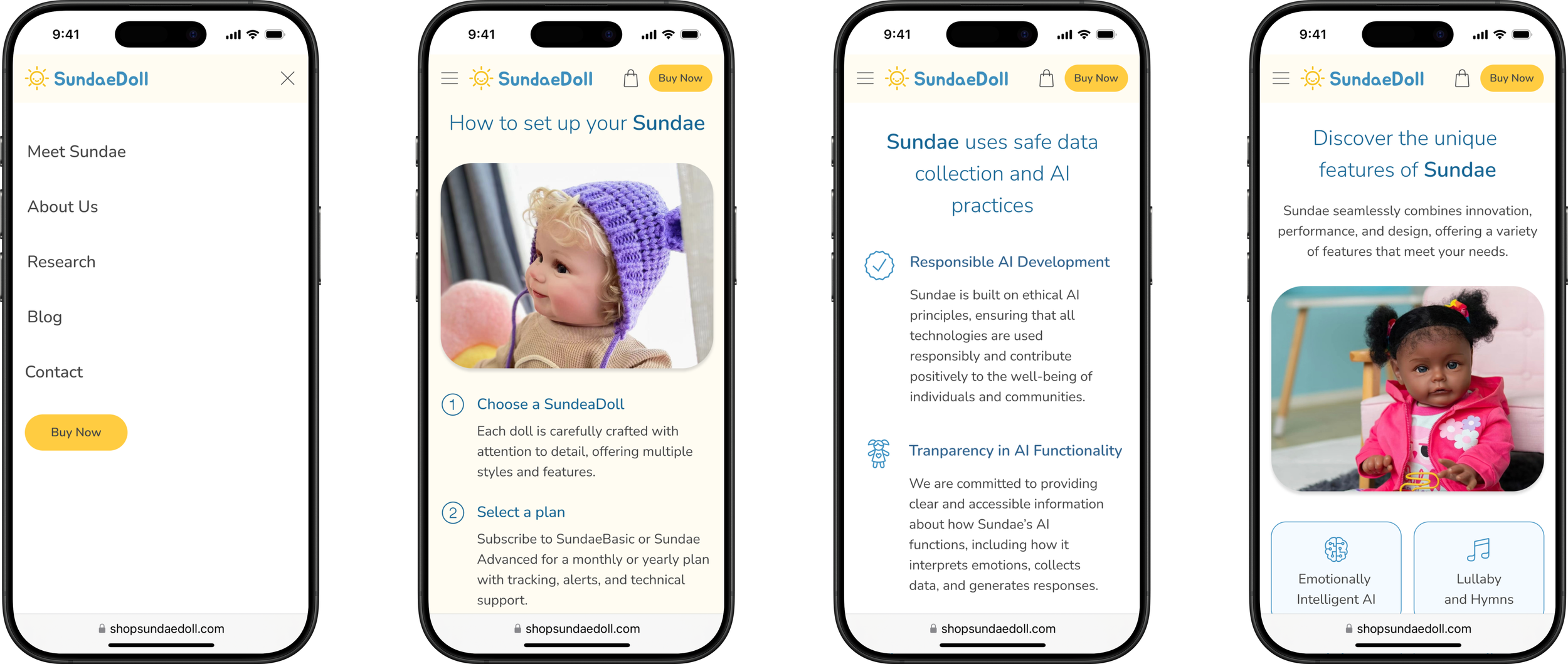
We created new pages for Meet Sundae, About Us, and Research to enhance credibility and build trust with customers by providing clear, detailed information about Sundae’s features, technology, safe data collection, AI safety, doll therapy theory, and clinical articles, as well as the company’s team and mission.
4. Trust & credibility
TEST & ITERATE
User Testing
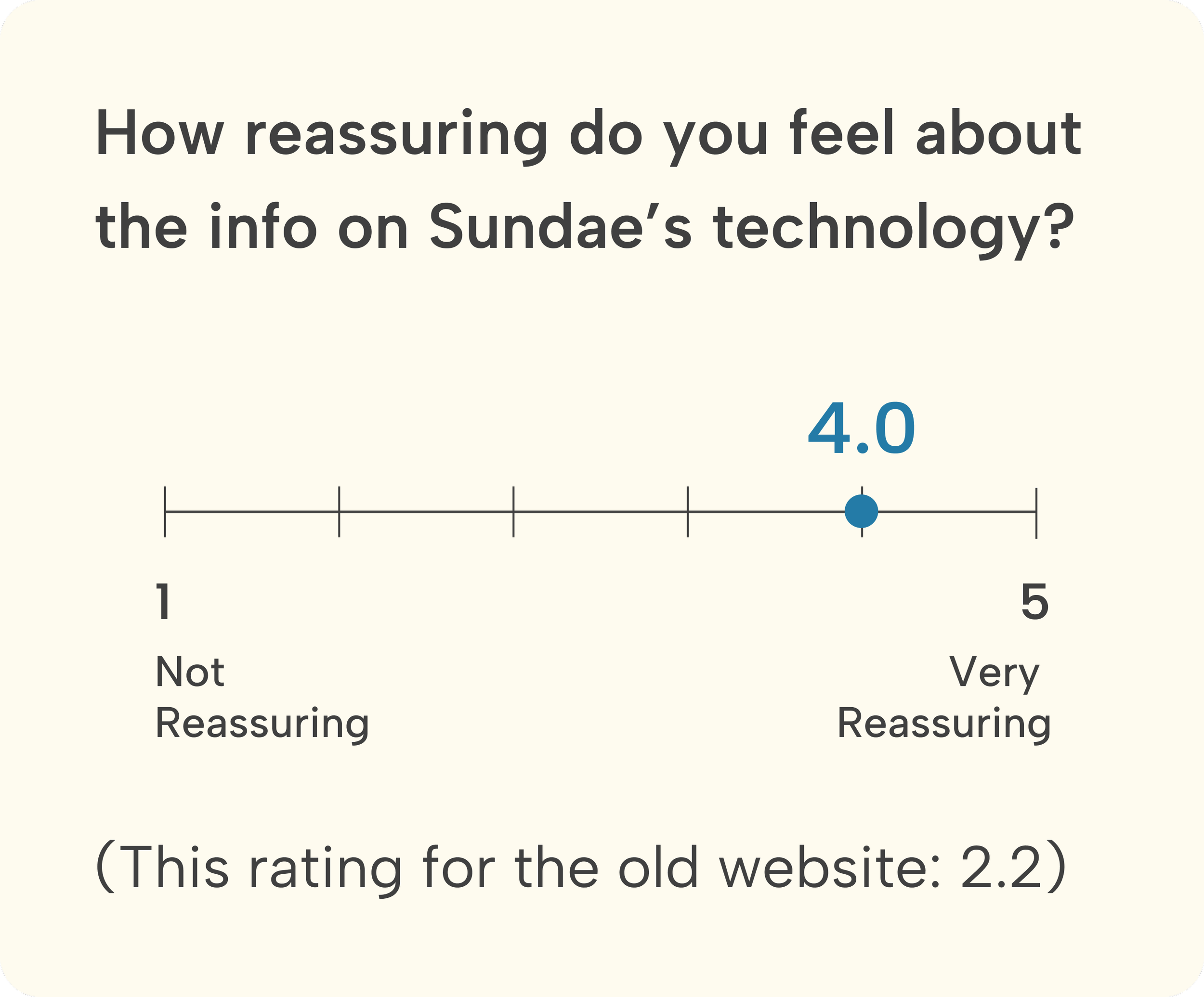
We conducted usability testing with six participants to evaluate the design, identify potential issues, and pinpoint opportunities for improvement. The testing provided valuable insights for enhancing the design and functionality.
Evaluate and improve
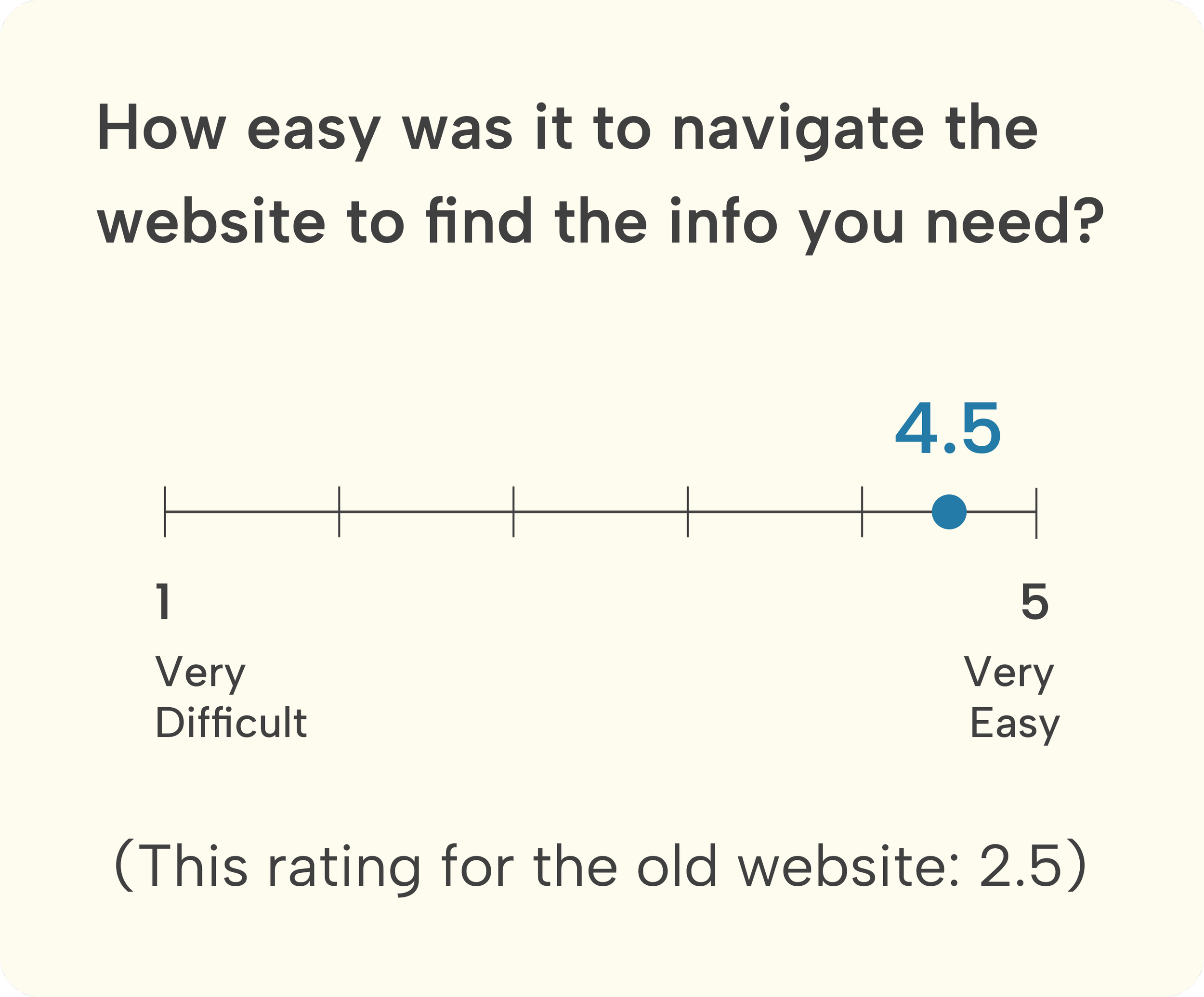
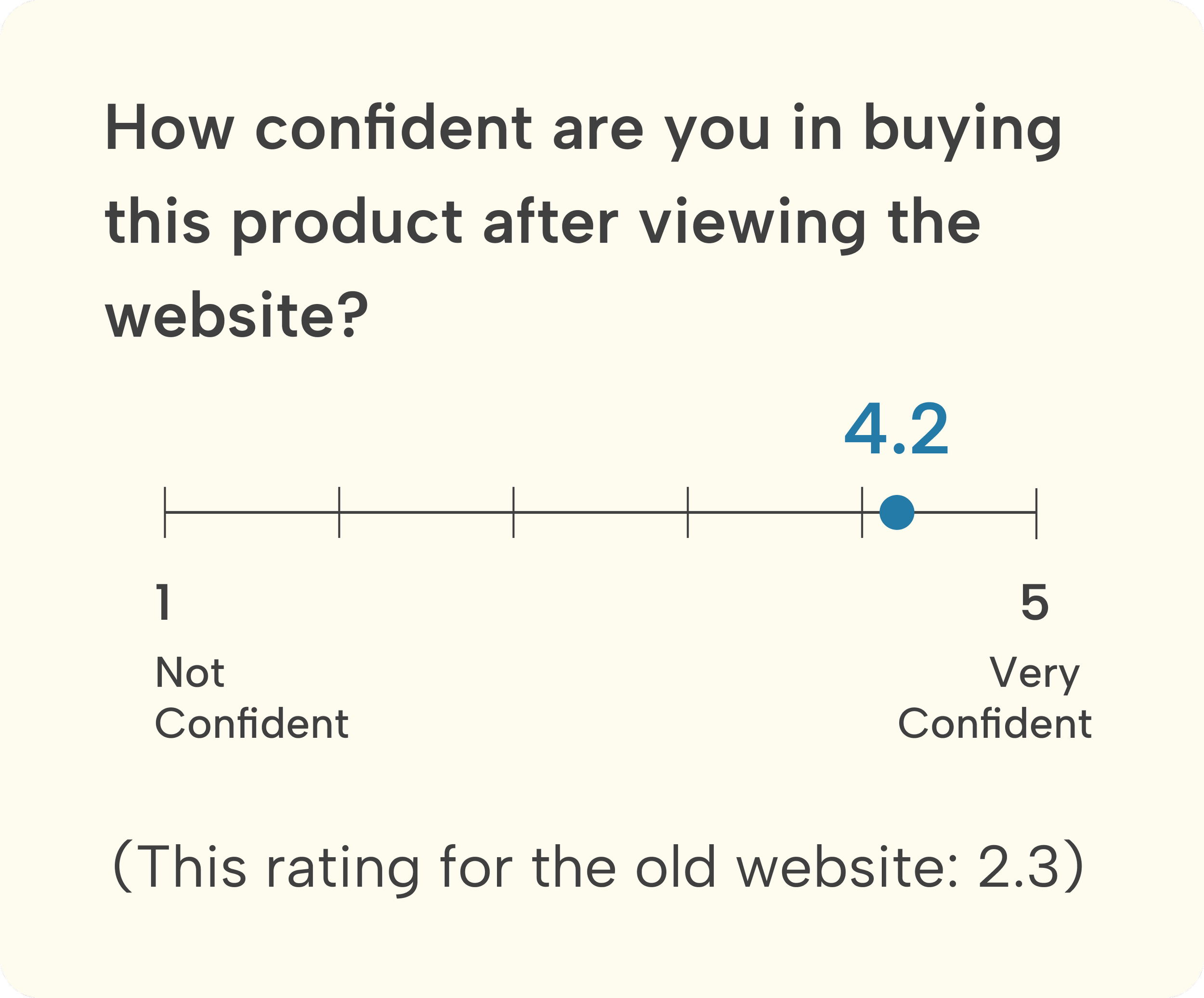
Success Metrics
What went well?

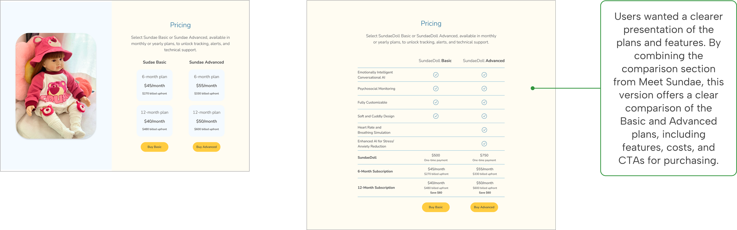
1. Revised the pricing section on the homepage
Iterations
Before
After
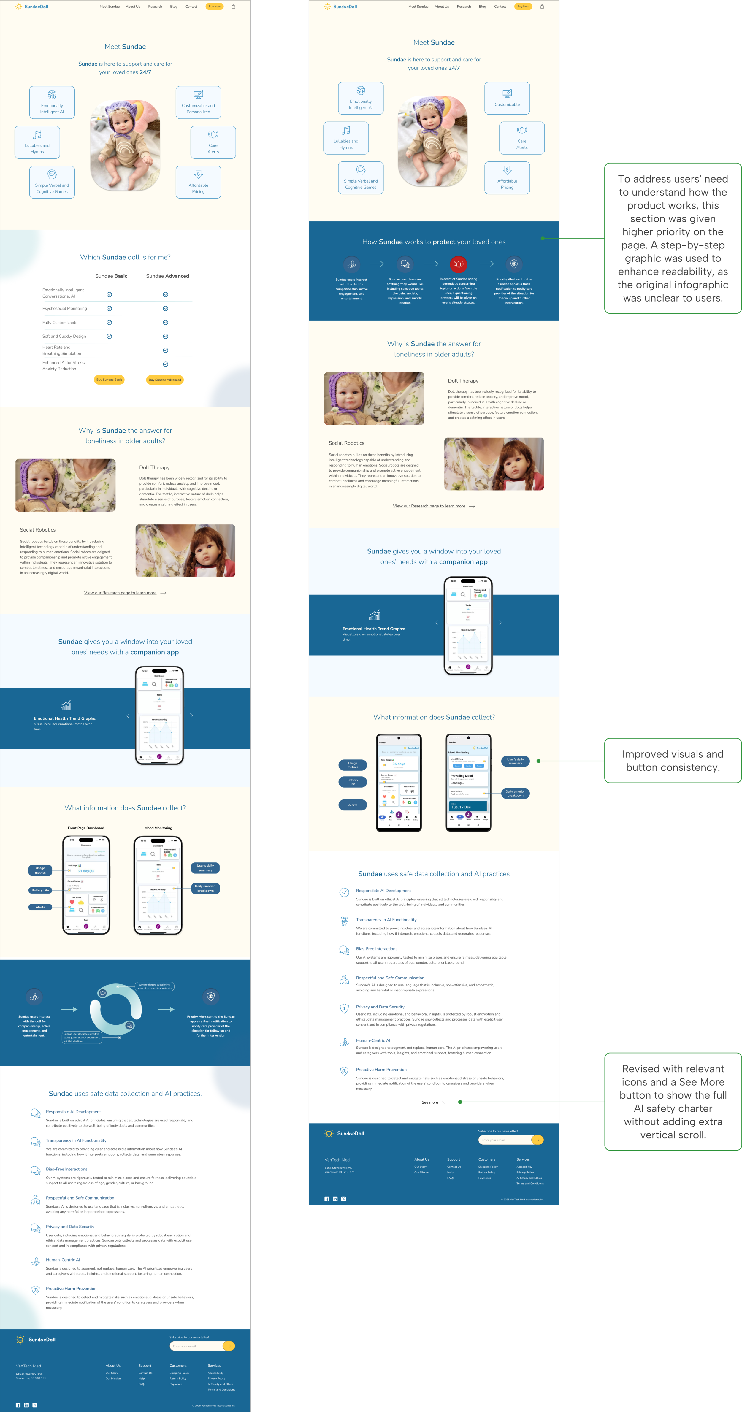
2. Revisions were made to the Meet Sundae page to meet user needs
Before
After
3. A better shopping experience
Before
After
Responsive Design
Optimized for desktop and mobile devices
We designed for desktop and also created the mobile version of the key screens to demonstrate to the client how the design would appear on mobile, ensuring a seamless, responsive layout and user experience.
UI Guide
Design system for handoff to developers
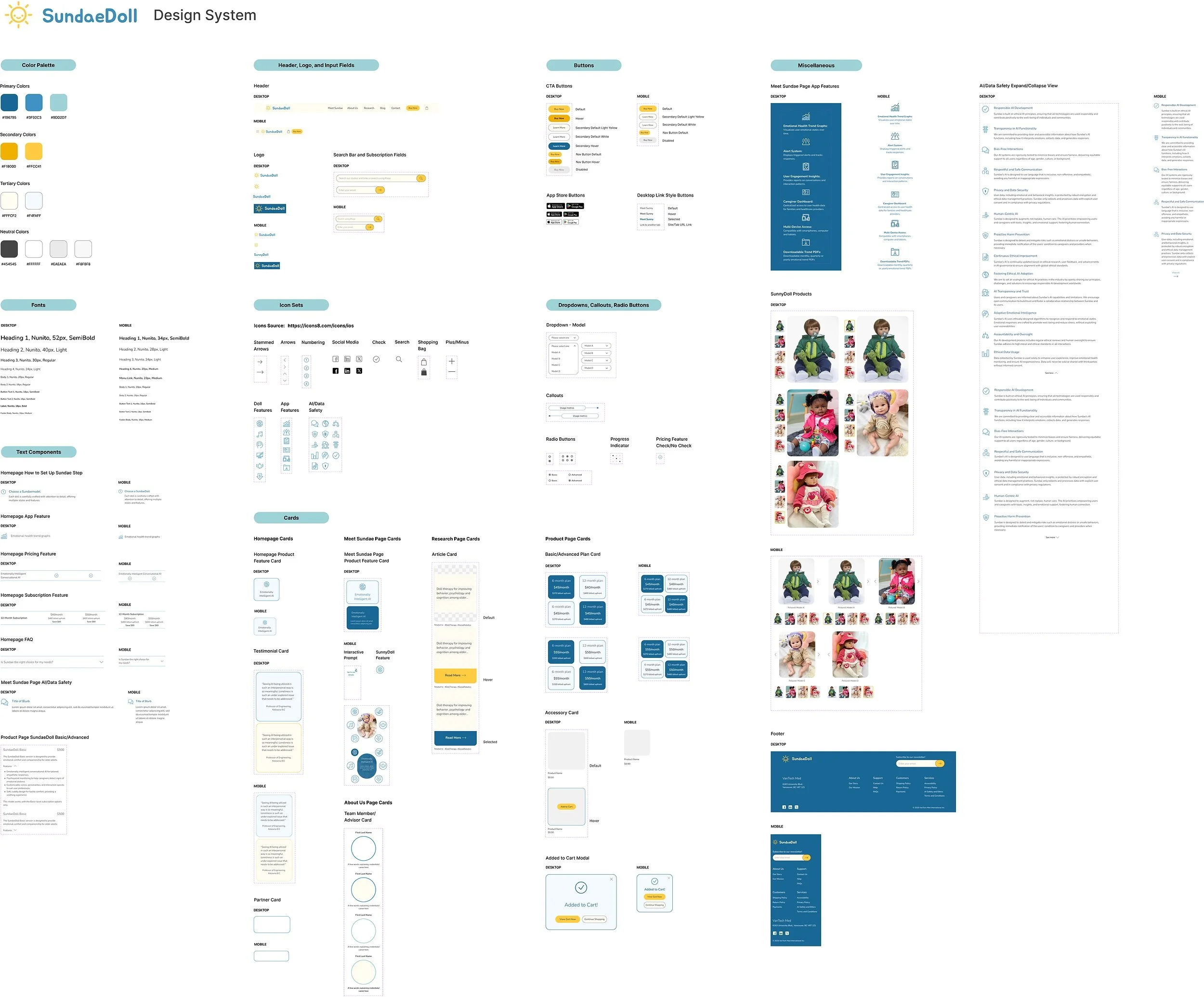
For the project handoff, we held a final meeting with the team, including developers, to ensure a smooth transition. We delivered the project's Figma file along with the design system, providing the client with a comprehensive reference for future updates and design continuity.
Testimonial
"This design team was amazing to work with. All members were very engaged, knowledgeable and handed in all deliverables on time. Each individual contributed meaningfully to the end project and was able to put together a very good design for our development team to go off of. They were able to actively listen to our team's requirements, issues and concerns and provide great work arounds and resolutions. I had a great experience with this team!”
- Vanessa L., CEO of VanTech Med
The client’s feedback
REFLECTION
The website’s new design is now live, and we are available to assist with any design-related questions. We look forward to evaluating the website's performance and conducting user testing if further improvements are needed.
Next Steps
Involving developers early on is essential, and we would appreciate scheduling another session after the handoff to address any follow-up items, such as design inconsistencies and misalignment issues.
Collaborating with designers, developers, and stakeholders underscored the importance of cross-functional teamwork. I took the initiative to facilitate meetings, ensuring regular check-ins and clear communication to keep the team aligned across time zones.
Lessons Learned
Working with a startup, where priorities and requirements can shift quickly, taught me how to handle feedback, make adjustments as needed, and remain adaptable to change while maintaining the overall design vision.